DaVinci Resolve Color Grading Workflow: 6 Techniques for Filmic & Cinematic Looks Without LUTs or Plugins
This video presents a 6-step "Color Grading Cheat Sheet" using native DaVinci Resolve tools to achieve professional, filmic, and cinematic results without LUTs or plugins.
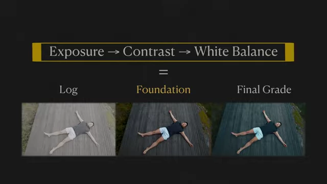
- The Foundation [00:18] involves adjusting exposure, contrast, and white balance in that order using HDR color wheels and offset.
- Soft Clip [03:26] is used to create filmic contrast with a soft roll-off in highlights and shadows, using the Custom Curves' soft clip controls.
- Masking [04:57] reshapes light, guides viewer attention, and balances the frame using gradient, circular, or custom curve masks with gamma adjustments.
- Minor Colors [07:19] addresses washed-out, dull, or non-cohesive colors by shaping hue, saturation, and luminosity with "Hue vs Luminosity" and "Hue vs Hue" curves.
- Tonal Grading [10:07] shapes the mood by tinting different tonal zones using Log Wheels, with careful adjustment of lower and upper ranges for clean separation.
- A Bonus tip [12:13] shows how to smooth harsh high-frequency detail using Mid-tone Detail (free version) or Texture Pop (Studio version) for a polished look.
Introduction [00:00]
The video introduces a "Color Grading Cheat Sheet" designed to instantly elevate color grades in DaVinci Resolve using simple, powerful techniques without requiring LUTs or plugins. The presenter emphasizes that each step builds upon the last, making it crucial to watch the entire tutorial.
1. Foundation [00:18]
The "golden formula" for a solid foundation in any color grade involves adjusting exposure, contrast, and white balance in that specific order. Getting this combination right is highlighted as being halfway to a successful grade.
- Exposure Adjustments [00:31]
- Purpose: Re-defines luminance, recovers highlights and shadows, and provides a clean starting point for grading.
- Tools: The HDR color wheels are recommended for their precise control over tonal zones.
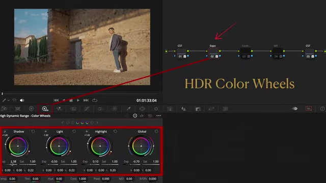
DaVinci Resolve interface highlighting HDR Color Wheels for precise tonal control in exposure adjustments. [ 00:01:24 ] - Guidance: For beginners, waveform and scopes, or a free false color monitor, can help guide exposure adjustments to ensure brightness falls into the correct tonal zones.
- Result: Exposure adjustments make the image's brightness fall into the right tonal zones.
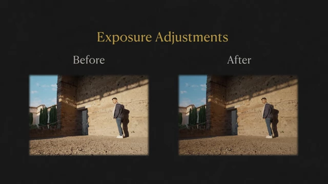
Before and after comparison of exposure adjustments improving the image's tonal balance. [ 00:01:49 ] - Workflow: These adjustments are made after footage conversion (CST) and before contrast.
- Contrast Adjustments [01:56]
- Purpose: Brings out depth, separation, and natural colors, defining the overall "feel" of the image.
- Tools: Use Contrast and Pivot together, found in the Log Wheels section.
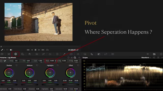
DaVinci Resolve interface showing the Contrast and Pivot controls in the Log Wheels, along with a waveform scope. [ 00:02:10 ] - Contrast: Increases or decreases separation between shadows and highlights.
- Pivot: Shifts where that separation occurs.
- DaVinci Wide Gamut (DWG): Start with a default Pivot value of 0.336 and adjust as needed to balance the image, avoiding crushed shadows or blown-out highlights.
- White Balance (Color Toning) [02:33]
- Concept: Preferred term is "color toning" as "white" is relative. The goal is to define the overall color temperature (warm, neutral, or cool).
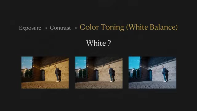
Examples of an image with warm, neutral, and cool color toning, demonstrating the impact of white balance. [ 00:02:44 ] - Tools: The offset wheel combined with the Vectorscope provides subtle precision to push the entire image warmer or cooler.
- Importance: Defining the white point early is critical, as all subsequent color decisions build upon this base tone.
- Workflow: The complete foundational workflow is
CST → Exposure → Contrast → WB → CST.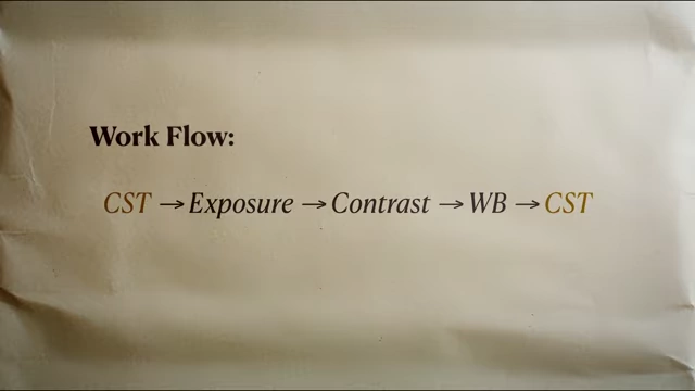
Workflow diagram illustrating the foundational color grading steps: CST, Exposure, Contrast, White Balance, and a final CST. [ 00:03:16 ]
- Concept: Preferred term is "color toning" as "white" is relative. The goal is to define the overall color temperature (warm, neutral, or cool).
2. Soft Clip [03:26]
This technique is used further down the color grading pipeline to achieve filmic contrast, characterized by a soft, organic roll-off in highlights and shadows while maintaining rich, dimensional midtones.
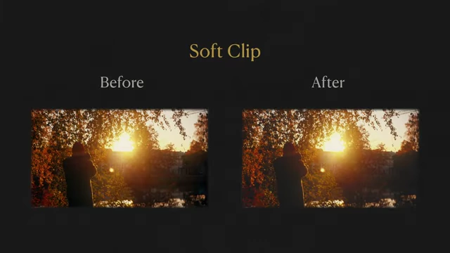
- Placement: Create a new node specifically for Soft Clip after your creative grade.
- The workflow for Soft Clip is
CST → Exposure → Contrast → WB → Minor Colors → Tonal Grade → Soft Clip → CST.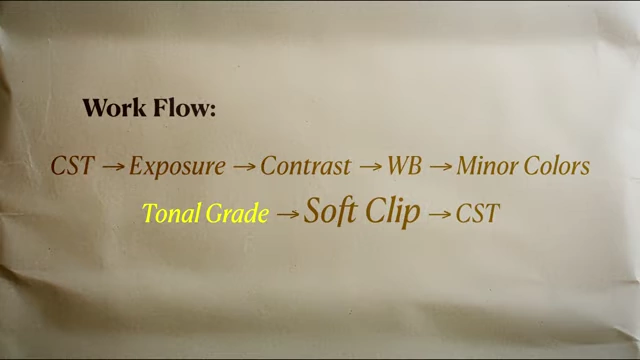
Comprehensive workflow diagram placing Soft Clip after Tonal Grade in the color grading pipeline. [ 00:03:51 ]
- The workflow for Soft Clip is
- Goal: Gently compress shadows and highlights as a final polish to bring back details and create a softer look.
- DaVinci Resolve Controls [04:07]
- Found next to the Custom Curves controls.
- Set the histogram to "Output" to see what's changing in real time.
- Low: Sets the luminance level where shadows begin gentle compression.
- Low Soft (L.S.): Controls the compression level of shadows (0 to 100), making them softer and revealing details.
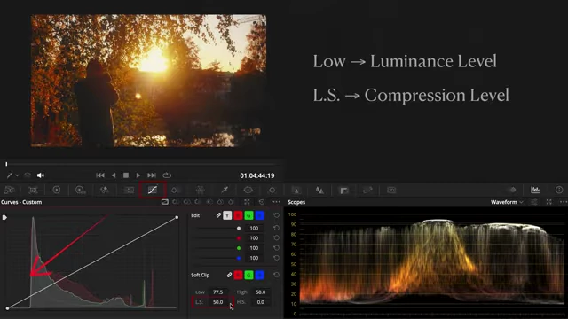
DaVinci Resolve interface showing the Soft Clip controls (Low, L.S., High, H.S.) next to the Custom Curves, with a histogram. [ 00:04:34 ] - High & High Soft (H.S.): Apply the same principles for highlights.
- Result: Finessing these four controls allows for looks ranging from a faded vintage to a clean cinematic roll-off.
3. Masking [04:57]
Masking is an increasingly vital part of the color grading workflow, especially when dealing with natural light that changes constantly, leading to uneven exposure or a lack of visual focus.
- Placement: Create a node for masking before primary corrections.
- The workflow for masking is
CST → Masking → Exposure → Contrast → WB → Minor Colors → Tonal Grade → Soft Clip → CST.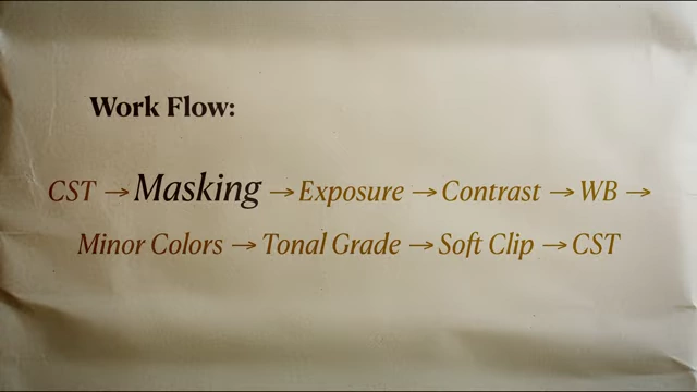
Workflow diagram illustrating Masking as an early step, before primary corrections. [ 00:05:27 ] - This placement makes adjustments feel integrated into the original lighting.
- The workflow for masking is
- Three Practical Uses [05:42]
- Re-shape the Light [05:46]:
- Method: Use gradient, circular, or custom curve masks.
- Application: Slightly lift or lower the gamma in the Color Wheels to simulate a directional light source. Adjust softness and distance for a natural falloff, connecting subjects more effectively to the scene's light.
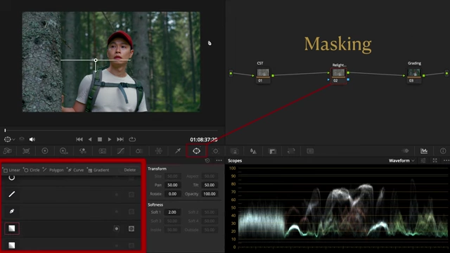
Selecting a gradient mask in DaVinci Resolve's Windows panel to reshape light. [ 00:05:54 ]
- Guide the Viewer's Eyes [06:16]:
- Method: Draw a circular or curve mask around the subject.
- Application: Brighten the subject or invert the mask to subtly darken the surroundings using gamma. The key is to keep the transition soft for seamless blending.
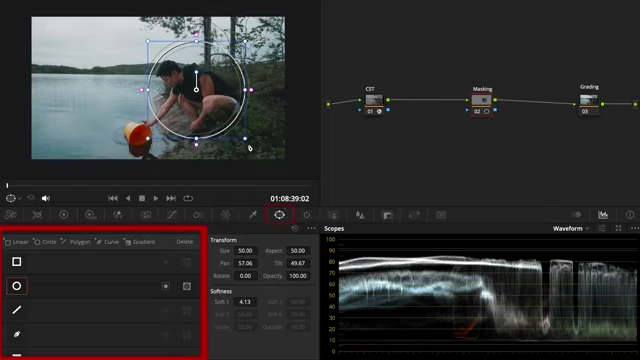
Applying a circular mask in DaVinci Resolve to guide viewer attention to the subject. [ 00:06:20 ]
- Balance the Frame [06:40]:
- Method: Use a gradient mask.
- Application: Gently lift darker areas where light ratios are too harsh or deep shadows distract. This smooths out exposure and improves overall composition.
- Re-shape the Light [05:46]:
- Impact: Masking makes the image feel more intentional and is both simple yet incredibly effective.
4. Minor Colors [07:19]
After primary corrections, the next step involves shaping colors through minor adjustments to address common color problems.
- Scenario 1: Washed-out Colors [07:24]
- Problem: Simply boosting global saturation often results in a harsh or "plastic" look because it alters luminance and contrast alongside color intensity.
- Solution: Shape with Luminosity [07:35]
- Think of color as 3-dimensional: Hue, Saturation, and Luminosity.
- Use the "Hue vs Luminosity" curve or "Color Slice" tool.
- Lower the luminosity of overly bright colors towards the mid-tone area (the "Hero Zone"). This makes colors appear richer, more grounded, and filmic.
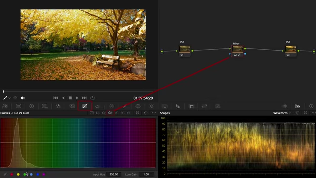
DaVinci Resolve interface showing the Hue vs Luminosity curve being used to shape washed-out colors. [ 00:08:04 ]
- Scenario 2: Dull Colors [08:27]
- Problem: Colors can appear lifeless, especially in backlit or overcast scenes.
- Solution: Lift Luminosity [08:40]
- Use the "Hue vs Luminosity" curve to lift the luminosity of specific dull hues.
- This technique adds energy and brilliance to those colors.
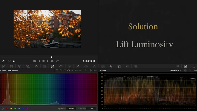
Using the Hue vs Luminosity curve to lift the luminosity of specific hues to revive dull colors. [ 00:08:44 ]
- Scenario 3: Non-Cohesive Colors [09:08]
- Problem: When colors throughout an image lack harmony, the entire scene feels disconnected.
- Solution: Hue vs Hue [09:20]
- Use the "Hue vs Hue" curve to qualify specific warm and cool tones.
- Gently nudge these qualified hues towards a desired color palette (e.g., "Orange Teal").
- Smooth out transitions to ensure the result feels natural and cohesive.
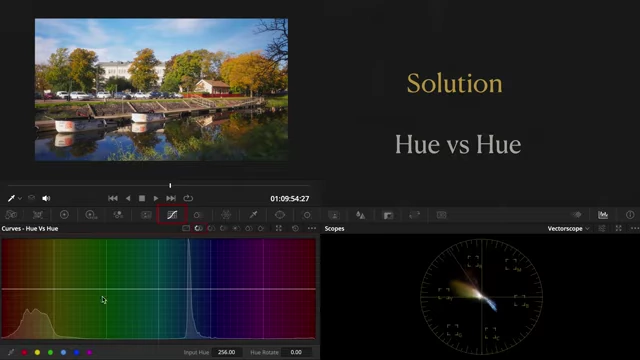
Adjusting the Hue vs Hue curve in DaVinci Resolve to achieve cohesive color palettes like Orange Teal. [ 00:09:23 ]
- Overall Impact: These subtle tweaks in color shaping allow a unique style to emerge.
5. Tonal Grading [10:07]
Once colors are balanced and cohesive, tonal grading is used to shape the mood by tinting different tonal zones.
Placement: The workflow for Tonal Grading is
CST → Masking → Exposure → Contrast → WB → Minor Colors → Tonal Grade → Soft Clip → CST.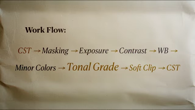
Workflow diagram showing Tonal Grade positioned after Minor Colors and before Soft Clip. [ 00:09:58 ] Methods:
- Custom Curves (covered in a previous video).
- Log Wheels [10:37]: A more intuitive and powerful alternative for beginners.
- Interface: Focus on the Shadows, Midtones, and Highlights wheels.
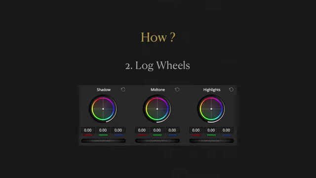
The Log Wheels interface in DaVinci Resolve, showing controls for Shadows, Midtones, and Highlights. [ 00:10:38 ] - Example: Adding Color Contrast while keeping the image warm.
- Midtone Wheel [10:59]: Nudge the color just south of the skin tone line on the Vectorscope to introduce natural warmth.
- Shadows Wheel [11:10]: Push slightly towards the opposite hue (e.g., Teal) to create contrast.
- Highlights Wheel [11:18]: Gently push highlights towards yellow. The intensity can be adjusted for subtle or stylized looks.
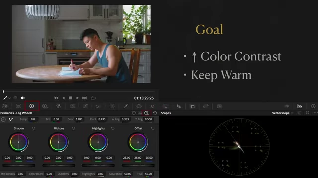
Using DaVinci Resolve's Log Wheels to add color contrast and warmth, guided by the Vectorscope. [ 00:10:55 ]
- Interface: Focus on the Shadows, Midtones, and Highlights wheels.
Important: Adjusting Ranges [11:27]
- Lower Range: Defines the separation point between shadows and midtones.
- Upper Range: Defines the separation point between midtones and highlights.
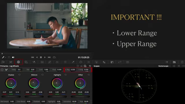
Important Log Wheels controls: Lower Range and Upper Range, which define tonal separation points. [ 00:11:28 ] - Effect: Fine-tuning these ranges creates clean, elegant separation between each tonal zone, allowing for a custom-built color grade without LUTs or plugins.
Bonus - Midtone Detail [12:13]
This bonus tip addresses images that appear harsh or gritty due to high-frequency detail, often found in scenes with busy textures like woods or city streets.
- Problem: Overwhelming texture can detract from the image.
- Solution (Free Version): Gently lower the "Mid-tone Detail (MD)" control found in the primary color wheels.
- Solution (Studio Version): Use "Texture Pop" from the Effect Library for more refined control.
- Application: Apply sparingly, just enough to polish the image without making it look flat or losing character.
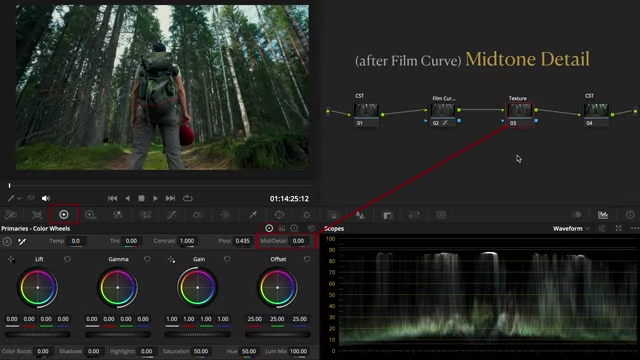
DaVinci Resolve interface showing the Mid-tone Detail control in the Primary Color Wheels. [ 00:12:33 ]
- Application: Apply sparingly, just enough to polish the image without making it look flat or losing character.