Mastering Cinematic Color Grading in DaVinci Resolve: A 5-Level Node-Based Workflow Tutorial
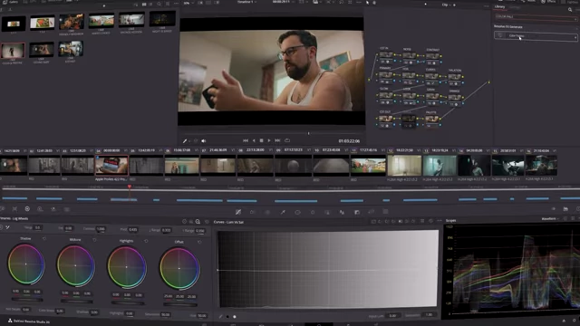
This tutorial outlines a comprehensive 5-level node-based workflow for achieving cinematic color grades in DaVinci Resolve. The process begins with Level 1: Correction and Foundation, involving Color Space Transform (CST) nodes for proper input/output gamma and color space, followed by noise reduction for image cleanup. Level 2: Contrast focuses on establishing exposure boundaries using primary wheels and fine-tuning with HDR wheels, then applying nuanced contrast adjustments with custom curves, including Hue vs. Hue for skin tone protection, Hue vs. Saturation, Hue vs. Luminance, and Luminance vs. Saturation for precise color and exposure control.
In Level 3: Style, the video introduces creative effects like "Contrast Pop" for clarity or softness, "Halation" for subtle highlight glow, and a "Glow" node with a warm color filter. Level 4: The Look defines the overall aesthetic using log wheels to introduce teal in shadows and warmth in highlights, along with adding "Film Grain" and a "Damage" node for a vintage, movie theater feel. Finally, Level 5: Check utilizes "False Color" for accurate exposure validation and a "Color Palette" tool for comprehensive color analysis to ensure consistent and intentional grading.

What're You Doin Here? [00:00]
The presenter introduces a five-level process for creating consistent, beautiful cinematic images and offers a free power grade and LUT.
The Overview [00:23]
The video will detail a five-level process, with each level containing multiple nodes crucial for achieving a cinematic look.
Node 1 [CST] [00:33]
This node sets up the initial color space transform (CST) to standardize footage.
- Input Settings:
- Input Color Space: Red Wide Gamut
- Input Gamma: Red Log 3G10 (specific to RED Komodo footage used in the example)
- Output Settings:
- Output Color Space: DaVinci Wide Gamut
- Output Gamma: DaVinci Intermediate
- Purpose: Using DaVinci's native wide gamut and intermediate settings provides the widest spread of exposure and color for flexible grading.
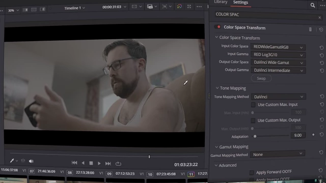
Color Space Transform (CST) input and output settings for the first node, converting RED Wide Gamut to DaVinci Wide Gamut [ 00:01:08 ]
Node 2 [CST] [01:13]
This second CST node brings the image back to a standard viewing gamma.
- Input Settings:
- Input Color Space: DaVinci Wide Gamut
- Input Gamma: DaVinci Intermediate (matching the output of the first CST node)
- Output Settings:
- Output Gamma: Gamma 2.4
- Purpose: While log footage offers the widest dynamic range and best color bit depth, this node transforms it back to a realistic, standard look, providing a clean canvas for artistic grading.

Color Space Transform (CST) output settings for the second node, converting to Gamma 2.4 for standard viewing [ 00:01:30 ]
The Foundation [01:42]
This section elaborates on the importance of using log footage for maximum dynamic range and color depth, emphasizing that the goal is realistic images, not grayscale.
Node 3 [Noise] [02:08]
This node is dedicated to noise reduction.
- Settings:
- Frames on either side: 3
- Type: Better
- Range: Medium
- Luma Threshold & Chroma Threshold: 7 for moderately noisy images, 13 for very noisy images.
- Purpose: To clean up image noise, though proper pre-production should minimize the need for heavy noise reduction.

Temporal Noise Reduction settings in DaVinci Resolve [ 00:02:20 ]
Your Specified Style [02:48]
The presenter distinguishes between color correction (bringing the image to a normal, neutral state) and color grading (applying a specified, subjective style that enhances the story).
Node 4 [Boundaries] [03:34]
This node uses primary wheels to set the exposure boundaries.
- Process:
- Adjust the LIFT (shadows) to be close to the bottom of the waveform without clipping.
- Adjust the GAIN (highlights) to a desired upper limit (e.g., around 896 on the waveform) without overexposing, allowing some headroom.
- Gamma (midtones) can be adjusted if needed, but the focus is on setting the black and white points.
- Purpose: To define the minimum and maximum exposure levels, preventing clipped blacks or blown-out highlights.

Primary Wheels being used to set exposure boundaries (Lift and Gain) on the waveform monitor [ 00:04:50 ]
Node 5 [EXP Contrast] [05:19]
This node uses HDR wheels for subtle contrast adjustments across different exposure zones.
- Process:
- Adjust 'Dark' and 'Shadow' wheels slightly up (e.g., 0.07) to brighten darker areas.
- Adjust 'Light' wheels slightly up to brighten lighter areas.
- Purpose: To make small, cumulative adjustments across the image's dynamic range without drastically altering it, as grading relies on many small changes.

HDR Wheels used for subtle exposure adjustments across different dynamic range zones [ 00:06:20 ]
Node 6 [XTRA Contrast] [06:19]
This node is where extensive contrast and color manipulation happens using various curve tools.
- Exposure Curves (Custom Curves):
- Apply a subtle S-curve by dragging the shadow point slightly down and the highlight point slightly up to introduce gentle contrast.
- Create additional points for fine-tuning midtones, lower midtones, and upper midtones to achieve desired contrast and mood. This is subjective and driven by artistic preference.
- The goal is to bring more "life" into the image through tailored contrast.

Custom curves for advanced contrast manipulation, demonstrating an S-curve and midtone adjustments [ 00:08:10 ]
- Hue vs. Hue:
- Protect skin tones by using the qualifier tool to select skin areas, preventing them from being affected by hue changes.
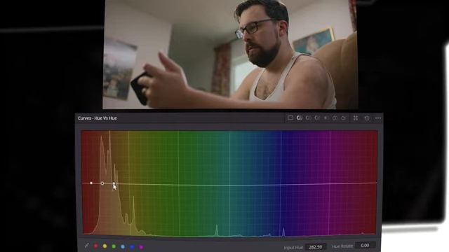
Hue vs Hue curve interface for protecting skin tones by selecting the orange/red range [ 00:09:34 ] - Adjust yellows slightly towards orange ("Sunny D color") and blues towards teal for a stylized look.
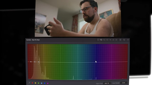
Hue vs Hue curve adjustments to shift yellows towards orange and blues towards teal [ 00:09:40 ]
- Protect skin tones by using the qualifier tool to select skin areas, preventing them from being affected by hue changes.
- Hue vs. Saturation:
- Increase saturation of oranges to bring life back into skin tones.
- Increase saturation of blues for a more vibrant look, if desired.
- Hue vs. Luminance:
- Slightly increase the luminance (exposure) of oranges/skin tones.
- Slightly decrease the luminance of blues to create visual separation or a specific mood.
- Luminance vs. Saturation:
- Reduce saturation in very dark (clipping black) and very bright (overexposed) areas to prevent artifacts.
- Adjust mid-gray saturation to fine-tune the overall vibrancy based on exposure levels.

Luminance vs Saturation curve adjustments, reducing saturation in clipped blacks and overexposed highlights [ 00:11:40 ]
Node 7 [POP] [12:02]
This node introduces "Contrast Pop," a clarity-like effect.
- Settings:
- Detail Amount: Adjust to increase sharpness (positive values) or soften the image (negative values). For this example, set to +0.023 for subtle sharpness.
- Detail Size: Adjust to control the size of details affected (e.g., 0.178).
- Low Threshold: Determines how deep into shadows the effect applies (e.g., 0.007).
- High Threshold: Determines how high into highlights the effect applies (e.g., 0.860).
- Softness: Controls the smoothness of the effect (e.g., 0.345).
- Purpose: To add subtle detail and "crunchiness" to the image or to soften it for a specific aesthetic.

Contrast Pop settings used to add subtle detail and "crunchiness" to the image [ 00:13:50 ]
Node 8 [HAL] [14:44]
This node adds "Halation," a highlight glow effect.
- Process:
- Use "View isolated regions" to select specific areas (e.g., glasses, window) where halation should be applied.
- Adjust "Di Electric Reflections" settings like "Strength" (e.g., 1.155) for the intensity of the reflection.
- Adjust "Secondary Glow" settings like "Strength" (e.g., 0.388) and "Gamma" (e.g., 1.85) to control the spread and color of the glow.
- Purpose: To simulate the light spill and subtle glow around bright areas characteristic of film, especially with strong light sources.

Halation settings for "Secondary Glow" to create a subtle highlight glow effect [ 00:16:08 ]
Node 9 [GLOW] [16:08]
This node adds a general "Glow" effect to further enhance highlights.
- Settings:
- Shine Threshold: Bring all the way down initially.
- Advanced Controls > Composite Type: Set to "Soft Light."
- Color Filter: Change to a warm orange/yellow tint.
- Global Blend: Adjust subtly (e.g., 0.078) to blend the glow into the original image, making it warmer.
- Purpose: To introduce an overall warm, soft glow that enhances the image's warmth and visual appeal.
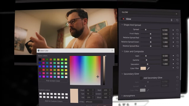
Glow effect with a warm orange/yellow color filter applied using Soft Light composite type [ 00:16:59 ]
Node 10 [THE LOOK] [17:29]
This node uses log wheels to establish the core color aesthetic ("the look").
- Shadows:
- Introduce a teal look by reducing red (e.g., -0.015) and increasing blue (e.g., +0.003).
- Offset:
- Warm the overall image by slightly increasing red (e.g., +0.0256) and decreasing blue (e.g., -0.0246) to introduce more yellow.
- Purpose: To create intentional color contrast (e.g., cool shadows, warm highlights) that defines the emotional tone and visual style of the film.

Log Wheels used to introduce teal into shadows and warm the overall image offset with red and yellow [ 00:18:49 ]
Node 11 [The Grain] [19:08]
This node adds film grain for a classic cinematic feel.
- Settings:
- Film Grain Presets: Select "35mm 400T" as a good starting point for a late '90s/early 2000s film look.
- Opacity: Adjust to control visibility. A subtle opacity (e.g., 0.713) is often preferred for a subconscious effect, or lower (e.g., 0.094) for an even more subtle digital-like grain.
- Purpose: To remove the overly digital look and introduce the texture and nostalgic feel associated with traditional film.

Film Grain settings with the "35mm 400T" preset and adjusted opacity for a filmic look [ 00:19:29 ]
Node 12 [Movie Theater Look] [20:05]
This node uses the "Film Damage" effect to add subtle imperfections.
- Settings:
- Set all parameters like Temperature, Blur, Tint, Focal Factor, Vignette, and Add Scratch to zero.
- Dirt Density: Set to 1.
- Dirt Size: Adjust to be very small.
- Dirt Blur: Set to a low value (e.g., 0.07).
- Dirt Color: Changed to white for a "thicker grain" effect.
- Purpose: To subconsciously evoke a classic movie theater experience by adding subtle "dirt" artifacts that mimic the imperfections of old film projections.

Film Damage settings adjusted to add subtle dirt artifacts for a "movie theater" feel, with dirt color set to white [ 00:21:09 ]
Node 13 [EXP CHECK] [21:34]
This node utilizes "False Color" for objective exposure validation.
- Placement: Place this node outside the main grading chain (after CST out) as a diagnostic tool.
- Interpretation:
- Magenta: Close to clipping in shadows.
- Blue: Dark shadows.
- Low Grays: Visible shadow details.
- Green to Pink: Desired range for key subject exposure.
- Pink: High-level skin tones.
- High Gray: Highlighted areas.
- Yellow: Close to clipping in highlights.
- Red: Clipping in highlights.
- Purpose: To visually assess and ensure proper exposure levels across the image, preventing accidental clipping or loss of detail, as human perception can be unreliable after prolonged grading.

False Color analysis with legend, visually mapping exposure levels to different colors for precise checking [ 00:22:31 ]
Node 14 [COLOR CHECK] [23:10]
This final node uses a "Color Palette" tool for visual color analysis.
- Placement: Place this node outside the main grading chain (after CST out) as a diagnostic tool.
- Purpose: To provide a visual representation of all the colors present in the image, useful for checking brand color accuracy or analyzing the overall color scheme. Adjustments to curves or saturation can then be made in previous nodes to achieve desired color balance.
Color Palette tool displaying dominant colors in the video frame for visual analysis and brand consistency checks [ 00:23:29 ]
Color Psychology [24:00]
The presenter encourages viewers to subscribe and like the video, and suggests another video on the psychological factors of color grading. He concludes with an inspirational message about initiating change.