Pro Colorist AMA: DaVinci Resolve Workflow, Exposure, Tone Mapping, and Client Best Practices
Summary:
This AMA session covers various advanced color grading topics in DaVinci Resolve:
- Exposure Chart DCTL: The speaker explains why exposure chart steps in linear space appear uneven due to the exponential nature of photometric stops, contrasting this with more even intervals in log spaces, and how display mapping compresses highlights.
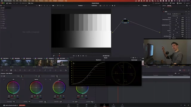
A waveform scope displaying a grayscale ramp with an S-curve, indicating how display mapping compresses highlights and expands shadows to fit the display's dynamic range. [ 00:09:50 ] - Input Transform Tone Mapping: Best practice is to avoid tone mapping on the input transform to preserve original pixel relationships, allowing data to clip out if the working space is appropriately chosen.
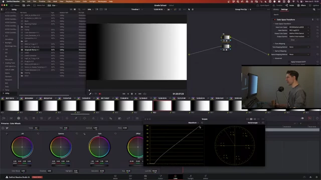
A grayscale ramp displayed on a waveform scope, showing clipped highlights when converting from Red Log 3G10 to DaVinci Intermediate without proper tone mapping. [ 00:12:40 ] - Exposure Adjustments: Linear gain or HDR Global exposure are preferred over offset for uniform response across the tonal range, with HDR Global being the same as linear gain but in stop units.
The DaVinci Resolve interface showing a node with linear gamma and the gain parameter set to 4, demonstrating a 2-stop increase in exposure using linear gain. [ 00:20:30 ] - White Point Discrepancies: The video speculates that the D65 white point for displays (vs. D56 for cameras) is due to hardware optimization for brightness, while D56 relates to film negative optimization.
- Banding Remediation: Solutions for banding include checking color management, adjusting Sat vs Sat or Lum vs Sat curves to roll off saturation in problematic areas, or using targeted noise reduction/blur with regraining.

The DaVinci Resolve curves palette showing a Lum vs Sat curve with a shoulder shape, designed to roll off saturation in bright areas to mitigate banding. [ 00:33:50 ] - Tone Mapping Differences: DaVinci tone mapping is presented as hue-preserving, while luminance mapping may not be, with synthetic charts being useful for evaluation.
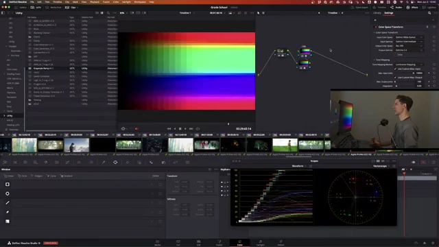
A color chip chart demonstrating the effect of Luminance Mapping on colors during tone mapping, showing how it preserves chromaticity. [ 00:42:30 ] - LUT Creation: Creating a LUT for a specific color space, like DaVinci Wide Gamut, involves designing the look directly within that color space, free from other transforms.

The DaVinci Resolve interface showing a custom curve being applied to an image, demonstrating a creative tonal adjustment within the working color space. [ 00:45:00 ] - Pre-IDT Adjustments: The speaker advises against exposure or color balance adjustments before the Input Device Transform (IDT), emphasizing that a robust working space should handle all camera data.
- Remote Grading & Client Review: Zoom, Setstream, Looper, and Pixel View are mentioned for remote sessions. Reviewing a rough cut before accepting a job is crucial for project assessment.
- Color Cube Interpretation: A color cube visually represents RGB in 3D, showing how color operations like saturation reduction transform the cube's shape, aiding in look development and validating transformations.
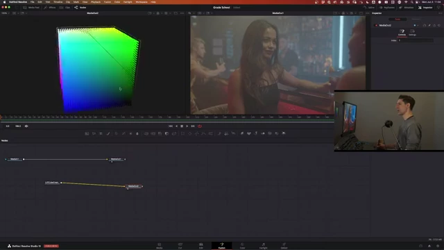
The Fusion page in DaVinci Resolve, showing the node tree for a Lut Cube Creator and its output displayed as a 3D histogram on the left viewer. [ 00:56:40 ]
Exposure Chart DCTL [1:51]
- Understanding Exposure Chart Behavior: The speaker addresses a common confusion regarding the exposure chart in linear space, where the steps appear uneven.
- This is because the exposure chart is designed to model photometric stimuli, where light stops increase exponentially, not linearly.
- For example, increasing exposure by one stop from 18% gray [0] means multiplying by 2 (0.18 * 2^1 = 0.36), and two stops means multiplying by 2^2 (0.18 * 4 = 0.72).
- The values get significantly larger with each stop, leading to uneven spacing on a linear scale.

A grayscale ramp in DaVinci Resolve's waveform scope, illustrating uneven steps in a linear space, with larger gaps between brighter values. [ 00:05:00 ]
- Logarithmic Space for Even Intervals: When working in a log space, these exposure intervals become much more even and predictable.
- Log curves, though not perfectly pure, allow for more intuitive exposure adjustments because changes via offset wheels yield consistent results regardless of the base value.
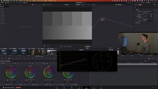
A grayscale ramp in DaVinci Resolve's waveform scope, showing more even steps in a log space compared to a linear space. [ 00:07:40 ]
- Log curves, though not perfectly pure, allow for more intuitive exposure adjustments because changes via offset wheels yield consistent results regardless of the base value.
- Display Mapping and the S-Curve: The principles discussed apply to the initial scene modeling.
- When mapping to a display, an S-curve is introduced, incorporating flare and surround compensation.
- This S-curve compresses highlights and expands shadows, ensuring that details are perceivable within the limited dynamic range of a display.
- Stops in the mid-range of the curve maintain more separation, while those in highlights are compressed to prevent clipping and preserve shape.
A waveform scope displaying a grayscale ramp with an S-curve, indicating how display mapping compresses highlights and expands shadows to fit the display's dynamic range. [ 00:09:50 ]
- Exposure Chart 1.4 Update: A new version of the exposure chart [1] is available, supporting resolutions beyond 1080p, including UHD and smaller resolutions.
Best Luminance Mapping on an Input Transform [11:12]
- Ideal Scenario: In a perfect workflow, tone mapping on the input transform would not be necessary.
- Purpose of Tone Mapping: Tone mapping ensures that the original scene's dynamic range fits within the working space's dynamic range.
- An example is using Red Log 3G10, which can decode to linear values well above 100, while DaVinci Wide Gamut Intermediate tops out at a linear value of 100.
- Without tone mapping, the higher values from Red Log 3G10 would clip in DaVinci Intermediate.
A grayscale ramp displayed on a waveform scope, showing clipped highlights when converting from Red Log 3G10 to DaVinci Intermediate without proper tone mapping. [ 00:12:40 ] 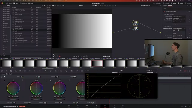
A grayscale ramp displayed on a waveform scope, showing the effect of tone mapping to roll off highlights and prevent clipping when converting to a narrower dynamic range. [ 00:13:20 ]
- Speaker's Preference: The speaker prefers to let data clip out the top of a well-chosen working curve rather than compressing it with tone mapping prematurely.
- The primary goal is to have full access to the original relationships of the pixels for grading.
- DaVinci Intermediate, with its peak at 100 linear value, is sufficient for most cameras, though some (like Red) may exceed this.
- Synthetic evaluations might suggest tone mapping is obvious, but in practice, preserving the original pixel relationships is more critical than preventing minor clipping at the extreme top of the working space.
Offset vs HDR Global vs Linear Gain for Exposure [19:22]
- Offset Limitations: The speaker has moved away from using offset for exposure adjustments, as it does not provide a uniform linear response across shadows, midtones, and highlights. This leads to inconsistent changes in different tonal regions.
- Preferred Methods:
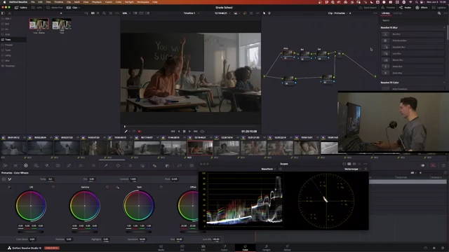
- Linear Gain: This involves setting a node's gamma to linear and then adjusting the gain. It provides a photometrically accurate exposure increase. For example, to go two stops brighter, multiply the linear input by 2^2 [4].
The DaVinci Resolve interface showing a node with linear gamma and the gain parameter set to 4, demonstrating a 2-stop increase in exposure using linear gain. [ 00:20:30 ] - HDR Global Exposure Wheel: This control within the HDR palette is functionally identical to linear gain and works in units of stops, which is convenient.
- Linear Gain: This involves setting a node's gamma to linear and then adjusting the gain. It provides a photometrically accurate exposure increase. For example, to go two stops brighter, multiply the linear input by 2^2 [4].
- Workflow Considerations: The speaker's only critique of the HDR Global wheel is its location in a separate palette, which adds extra clicks and time in a professional workflow where exposure and contrast are adjusted for nearly every shot.
- Maintaining a single-node workflow for core adjustments is preferred for efficiency.
- Pure Log Curves: Log curves that are truly "pure" (without a linear section in the shadows) tend to perform better with offset adjustments, preventing "fogging" or "milking out" of shadows that can occur with common camera log curves.
Why is D65 the White Point of Displays When Cameras Have a D56 White Point? [25:58]
- Speculative Answer: The speaker admits he doesn't know the definitive historical reason but offers a hypothesis.
- Display White Point (D65): It is likely chosen for hardware optimization in manufacturing to achieve the brightest possible image from average screens. D65 offers more energy output than, for example, D50. This aligns with how DCI white point in cinemas was chosen to optimize projector lamp output.
- Camera White Point (D56): The 5600K daylight temperature for camera sensors (derived from film negative optimization) was chosen to interact properly with daylight and help cinematographers achieve correct exposure and colors easily.
- Global Variations: The speaker highlights that white points vary internationally, citing D93 as the native (and extremely blue) white point used in Japan, which colorists there must adapt to.
What Do You Do When There's Banding in the Camera Negative? [30:08]
- First Principle: "Do No Harm":
- Always check your color management setup and any Look Up Tables (LUTs) in your pipeline to ensure they are not exacerbating the banding issue.
- Case-Dependent Solutions: The approach depends heavily on the specific shot and the nature of the banding.
- Addressing Banding in High Chroma Areas:
- Banding often appears in bright, highly saturated areas.
- Adjust Saturation vs Saturation or Luminance vs Saturation curves.
- A common technique is to grab the rightmost control point on these curves and gently drop it down to roll off saturation in those problematic areas. Create a shoulder to avoid affecting skin tones and other critical areas.
The DaVinci Resolve curves palette showing a Lum vs Sat curve with a shoulder shape, designed to roll off saturation in bright areas to mitigate banding. [ 00:33:50 ]
- Last Resort - Noise Reduction/Blur:
- Use DaVinci Resolve's Noise Reduction tool, preferring spatial over temporal noise reduction. Start with a small radius and feather it in.
- Alternatively, use a Power Window to isolate the banded area, apply a blur (preferably in linear gamma), and then regrain that specific area to blend it back with the overall image texture. This helps smooth out the banding while maintaining a natural feel.
What's the Difference Between DaVinci and Luminance Mapping Tone Mapping? [38:07]
- Core Difference: The distinction lies in how they handle colors during the compression journey. The 1D tone curve shape is often similar, but the 3D color transformation differs.
- Luminance Mapping: This scheme aims to be "chromaticity linear."
- It analyzes the original hues of the image, remembers them, applies the luminance mapping (tonal compression/shaping), and then attempts to remap the colors back to their original or intended chromatic values.
- The speaker often defaults to Luminance Mapping out of familiarity, as it has been available longer.
- DaVinci Tone Mapping: This is likely the hue-preserving option.
- It aims to compress tones while maintaining the original hue relationships.
- Evaluation: Tools like Thatcher Freeman's RGB Chips DCTL (available on GitHub) are useful for synthetically evaluating and visualizing the subtle differences in color treatment between the two methods during tone mapping.
A color chip chart demonstrating the effect of Luminance Mapping on colors during tone mapping, showing how it preserves chromaticity. [ 00:42:30 ] 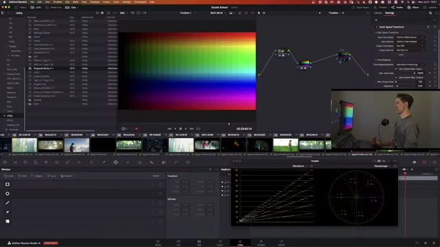
A color chip chart demonstrating the effect of Saturation Preserving tone mapping, showing distinct differences in color treatment. [ 00:43:20 ]
- Recommendation: Users should experiment with synthetic charts to understand how each tone mapping option affects colors and choose the one that best suits their project's needs.
How Do We Create a LUT for DaVinci Wide Gamut? [43:50]
- The "Dirty Secret" of LUT Design: To create a LUT specifically designed for a particular color space (e.g., DaVinci Wide Gamut Intermediate), the key is to design the look within that exact color space.
- Workflow Steps:
- Set Up Working Environment: Configure your project or nodes so that your image is converted into the target color space (e.g., DaVinci Wide Gamut Intermediate) at the beginning of your grading chain, with no output transform yet applied.
- Design the Look: Apply your creative adjustments (curves, primaries, etc.) to achieve your desired aesthetic. For example, build a custom S-curve using the Custom Curves tool.
The DaVinci Resolve interface showing a custom curve being applied to an image, demonstrating a creative tonal adjustment within the working color space. [ 00:45:00 ] - Isolate the Look: Turn off any nodes or transforms (like input transforms or output transforms) that you do not want to be part of the final LUT. The LUT should only contain the creative adjustments made in the working space.
- Generate the LUT: Use DaVinci Resolve's LUT generation tools to export the look as a 3D LUT (e.g., a 33-point or 65-point cube file).
- Principle: The LUT will take an image in the specified input color space (DaVinci Wide Gamut Intermediate) and output an image in the same color space, with your creative look applied. This ensures consistency and proper integration into a color-managed workflow.
Do You Ever Make an Exposure Adjustment Before the IDT? [47:21]
- Speaker's Stance: No, absolutely not.
- Rationale:
- Working Space Integrity: The purpose of an Input Device Transform (IDT) is to convert camera original footage into a standardized working color space (like DaVinci Wide Gamut Intermediate) where all footage, regardless of camera source, shares a common metric.
- Maintaining Freedom: A well-chosen working space should by definition accommodate all the dynamic range and color information from the camera's original footage without needing any pre-treatment.
- Identifying Poor Choices: If a working space consistently requires pre-treatment (exposure, color balance, etc.) to avoid problems, it suggests that the working space itself is poorly chosen or inadequate.
- Consistency is Key: The entire advantage of a color-managed workflow using a working space is that all grading operations occur in a consistent, unified environment. Introducing pre-IDT adjustments undermines this consistency and the benefits of the color pipeline.
Best Practices for Proper Client Monitoring When Doing Remote Sessions [51:01]
- Software Solutions:
- Zoom: The speaker has used Zoom extensively for remote sessions. While not perfect (e.g., data rate control limitations), it remains a viable and accessible baseline solution, especially for new colorists.
- Setstream: Currently, the speaker highly rates Setstream, indicating it's a product he is actively using and enjoying.
- Other Options: Looper and Pixel View are also mentioned as promising solutions that other colorists use for accurate color transmission to clients.
- Range of Solutions: Remote monitoring solutions vary widely in their features, cost, and the level of color accuracy they provide. There are more high-end options available, but the speaker tends to seek out more cost-effective solutions.
Should We Review the Footage Before Agreeing the Price? [52:58]
- Reviewing Footage Before Job Acceptance:
- Yes, absolutely. The speaker emphasizes that he would never accept a job without reviewing the rough cut of the footage.
- Reasons for Review:
- Project Length & Cuts: To assess the overall duration and the number of cuts, which directly impact the workload and pricing.
- Cut Quality: To evaluate the smoothness and consistency of the edits.
- Current Footage State: To see the existing quality (good or bad) of the footage. If footage already looks amazing, the client's expectations for grading might differ.
- This initial review is critical for accurately pricing the job and setting expectations.
- Working with References:
- Client References: Clients often provide reference images or videos to convey their desired look.
- Colorist Suggestions: The colorist may also present references that come to mind after reviewing the footage, proposing potential creative directions.
- Organic Process: In some cases, there might be no specific references, and the grading process becomes an organic collaboration, shaping the look directly on the images through client feedback (e.g., "add a little more contrast," "cool the shadows").
How to Read a Color Cube and How to Interpret That Information? [55:40]
- Viewing a Color Cube: The best native and free way to view a color cube is within DaVinci Resolve's Fusion page.
- Setup in Fusion:
- Add an "Lut Cube Creator" node and a "Media Out" node.
- Send the "Lut Cube Creator" output to the first viewer.
- In the viewer, set the display to "3D Histogram" and then to "Solid."
- Set sampling to 1:1.
The Fusion page in DaVinci Resolve, showing the node tree for a Lut Cube Creator and its output displayed as a 3D histogram on the left viewer. [ 00:56:40 ]
- Setup in Fusion:
- Understanding the Cube's Geometry:
- A 3D color cube visualizes the relationship between red, green, and blue values in three dimensions.
- 8 Vertices (Corners): These represent key color points:
- Black (bottom-rear-left, all RGB = 0)
- White (top-front-right, all RGB = 1)
- 6 Primary/Secondary Colors: Red, Green, Blue, Cyan (Green + Blue), Magenta (Red + Blue), Yellow (Red + Green).
- Example: Desaturation: When saturation is reduced to zero, the entire color cube collapses into a single line, often called a "lightsaber," representing the grayscale axis from pure black to pure white.
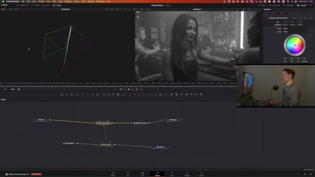
A 3D color cube transformed into a single line (lightsaber) after applying a full desaturation, illustrating how all color information collapses onto the grayscale axis. [ 00:58:20 ]
- Interpreting Operations on the Cube:
- Basic Operations: With practice, you can intuitively understand how basic grading operations affect the cube:
- Global Gain: Shrinks the cube towards the black point.
- Lift: Raises the bottom (shadows) of the cube.
- Offset/Brightness: Moves the entire cube uniformly.
- Look Development: The cube is invaluable for evaluating how complex LUTs or creative transforms affect the entire color space.
- By applying a LUT to the cube, you can observe shifts in hue, saturation, and luminance across all possible input colors, not just the pixels in your current image.
- This helps validate whether a look is smooth, desirable, and free of unintended artifacts or breaks in the color space.

A 3D color cube with a creative LUT applied, showing how specific colors are shifted, compressed, or expanded within the color space. The speaker points to visual changes in the cube's structure. [ 01:00:00 ]
- Basic Operations: With practice, you can intuitively understand how basic grading operations affect the cube:
- Benefit: The color cube provides a low-context, comprehensive view of how transformations impact all possible input pixels, allowing colorists to ensure smooth and intentional color behavior.