DaVinci Resolve Color Grading Tutorial: Creating a Painterly Look Inspired by Art
This tutorial demonstrates how to leverage artistic inspiration from paintings to craft a unique color grade in DaVinci Resolve, using Edward Hopper's "Nighthawks" as a reference. The instructor emphasizes that paintings offer distinct characteristics like dynamic range, color palette, and texture compared to digital footage.
- The process begins by establishing a color-managed project in DaVinci Wide Gamut, DaVinci Intermediate.
- The first step involves adjusting the color balance using the HDR tab to introduce a "grainy, shiny" feel reminiscent of paint.
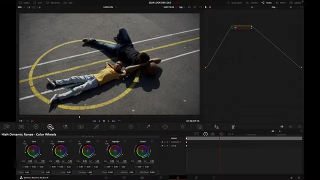
DaVinci Resolve HDR color wheels being adjusted for initial balance [ 00:02:40 ] - Contrast is then refined using RGB curves, compressing shadow details by lifting blacks to achieve a painterly aesthetic.
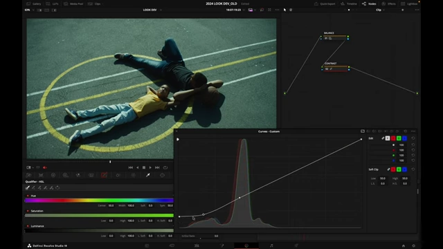
DaVinci Resolve RGB curves showing lifted blacks to compress shadow detail [ 00:03:49 ] - Shadows are subtly tinted with cyan and highlights with warmth in the red channel, mirroring the painting's color scheme.
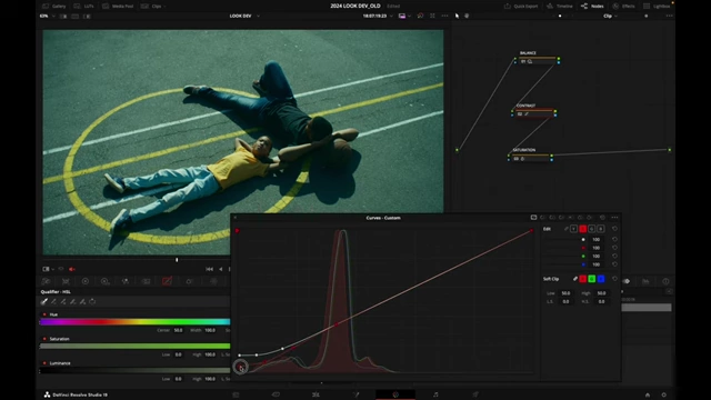
DaVinci Resolve red channel curve illustrating cyan tinting in shadows and subtle warmth in highlights [ 00:05:09 ] - Overall saturation and color density are adjusted using the Color Slice and hue vs. saturation curves, specifically enhancing cyan and blue tones.
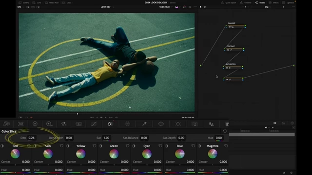
DaVinci Resolve Color Slice interface used to adjust overall saturation and increase color density [ 00:05:54 ] - To counteract the digital appearance, a "Film Look Creator" effect is applied, adding 16mm film grain and softening the image to mimic canvas texture.
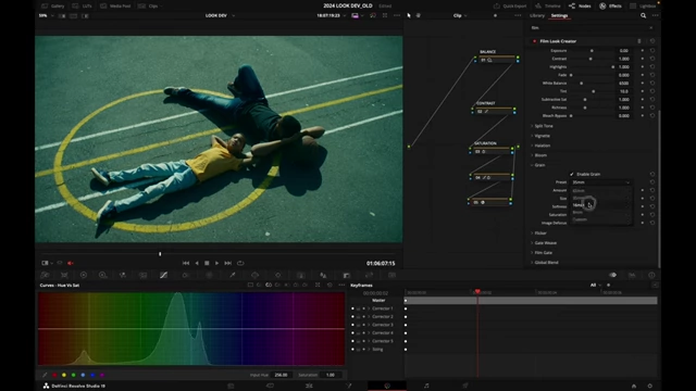
DaVinci Resolve Film Look Creator settings with 16mm film grain enabled to add canvas-like texture [ 00:07:23 ] - Finally, an accent of saturation is added to the yellow tones, drawing attention to specific elements.
The tutorial concludes by showcasing the "before and after" of the graded footage, highlighting the power of diverse artistic references in color grading. Before:
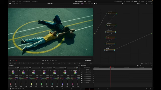
DaVinci Resolve Color Slice targeting the yellow vector to add an accent of saturation [ 00:10:37 ] After: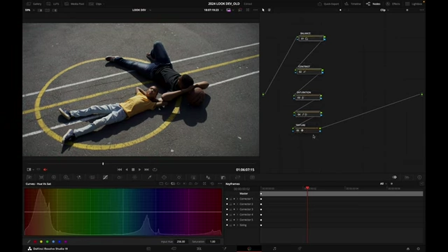
Original footage before color grading [ 00:09:07 ] 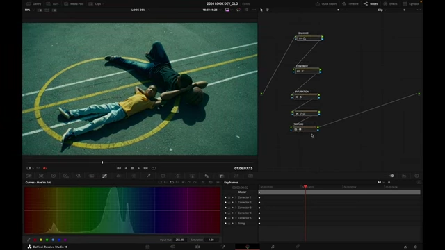
Final color-graded footage, transformed to resemble a painting's aesthetic [ 00:09:08 ]
Introduction [00:00]
The video highlights the critical role of references for colorists, especially when working with clients who often provide extensive visual bibles. It emphasizes that while movies, music videos, and commercials are common references, paintings offer a particularly unique source of inspiration due to their distinct characteristics.
- Importance of References for Colorists [00:10]
- Clients frequently present "bibles" of references for various projects.
- These references can span movies, music videos, and commercials.
- Paintings as a Unique Source of Inspiration [00:24]
- Paintings differ significantly from digital screen-based media.
- Dynamic Range: The dynamic range of paint on canvas is not the same as digital footage.
- Color Palette: Paintings often feature unique and dense color palettes.
- Replication Challenges: Replicating these painterly characteristics with digital footage can be challenging.
- Goal of Inspiration: The aim is not to replicate a painting one-to-one, but to draw inspiration from its elements.
- Inspired elements: cyan wash, complementary warm and cool tones, texture, and contrast.
- Paintings differ significantly from digital screen-based media.
- Project Setup in DaVinci Resolve [02:25]
- The demonstration is conducted in a color-managed project.
- All operations occur within DaVinci Wide Gamut and DaVinci Intermediate.
- Chosen Painting for Reference: Edward Hopper's "Nighthawks" [01:11]
- The classic painting "Nighthawks" by Edward Hopper is selected as the primary visual reference.
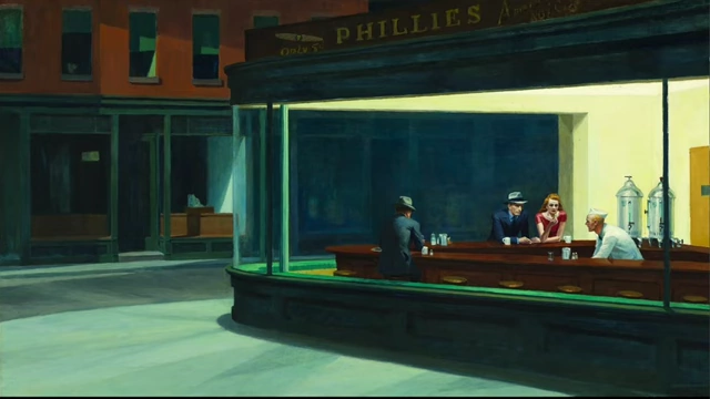
Edward Hopper's "Nighthawks" painting, the artistic inspiration for the color grade [ 00:01:15 ]
- The classic painting "Nighthawks" by Edward Hopper is selected as the primary visual reference.
Creating the Look [02:36]
1. Initial Balance and Dynamic Range Adjustment [02:38]
- The first step in creating the look involves using the HDR tab.
- Injecting "Grainy, Shiny" Feel: Adjustments are made to inject a "grainy, shiny" quality, drawing from the painting's characteristics.
- Overall Balance: The color wheels in the HDR tab are used to achieve an initial color balance.
DaVinci Resolve HDR color wheels being adjusted for initial balance and to introduce a "grainy, shiny" feel [ 00:02:40 ]
- The first step in creating the look involves using the HDR tab.
2. Contrast and Shadow/Highlight Treatment [03:16]
- A new node is created specifically for contrast adjustments.
- Compressing Shadow Detail: RGB curves are utilized to reduce detail in the shadows by lifting the blacks.
- This technique helps to achieve a more "painterly feel" by compressing the dynamic range in the darker areas.
DaVinci Resolve RGB curves showing lifted blacks to compress shadow detail and achieve a painterly aesthetic [ 00:03:49 ]
- This technique helps to achieve a more "painterly feel" by compressing the dynamic range in the darker areas.
- Tinting Shadows and Highlights: Further adjustments are made within the red channel curves.
- Cyan in Shadows: Shadows are tinted with a cyan hue. [04:42]
- Warmth in Highlights: A subtle warmth is added to the highlights. [05:16]
- This aims to complement the color scheme observed in the reference painting, while preserving skin tones.
DaVinci Resolve red channel curve illustrating cyan tinting in shadows and subtle warmth in highlights [ 00:05:09 ]
- Compressing Shadow Detail: RGB curves are utilized to reduce detail in the shadows by lifting the blacks.
- A new node is created specifically for contrast adjustments.
3. Color Saturation and Density [04:10]
- Another node is added to manage overall color.
- Increasing Overall Saturation: The Color Slice tool is used to globally increase saturation. [04:15]
- Addressing Color Density: The density of colors, particularly vivid yellows, is addressed to make them less overpowering, creating a denser, more artistic feel. [05:50]
DaVinci Resolve Color Slice interface used to adjust overall saturation and increase color density [ 00:05:54 ] - Hue vs. Saturation Adjustment: The hue versus saturation curves are used to fine-tune specific color ranges. [06:06]
- Saturation in cyans and blues is slightly increased.
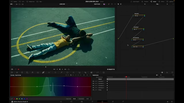
DaVinci Resolve hue vs. saturation curve for enhancing cyan and blue tones [ 00:06:28 ]
- Saturation in cyans and blues is slightly increased.
- Another node is added to manage overall color.
4. Texture and Softness [06:35]
- To move away from a "digital" appearance and closer to a painterly texture, a dedicated node is added.
- Applying Film Look Creator: The "Film Look Creator" effect is introduced into the node graph. [06:45]
- Enabling Film Grain: 16mm film grain is enabled and its amount increased to simulate the texture of a canvas and layers of paint. [06:55]
DaVinci Resolve Film Look Creator settings with 16mm film grain enabled to add canvas-like texture [ 00:07:23 ] - Softening the Image: The focus is adjusted to slightly soften the image, contributing to the overall painterly aesthetic. [07:45]
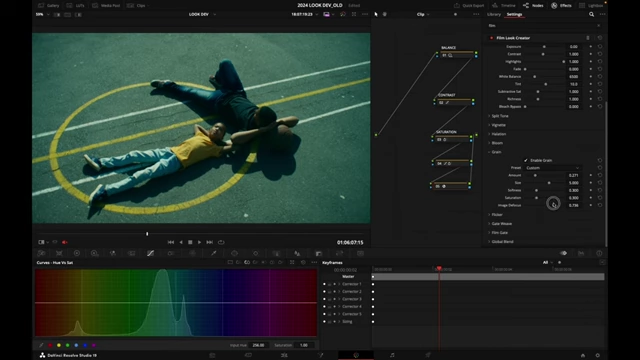
DaVinci Resolve Film Look Creator's focus adjustment used to slightly soften the image, mimicking paint texture [ 00:07:48 ]
- To move away from a "digital" appearance and closer to a painterly texture, a dedicated node is added.
5. Accent Color (Optional) [10:12]
- An additional node is introduced to create an accent of color, drawing inspiration from specific vibrant elements in the painting.
Review and Conclusion [09:03]
- The video concludes with a "before and after" comparison of the graded footage, demonstrating the complete transformation.
Before:
After:
Original footage before color grading [ 00:09:07 ]
Final color-graded footage, transformed to resemble a painting's aesthetic [ 00:09:08 ] - The instructor emphasizes the iterative process of stacking elements in nodes until the desired look is achieved. [09:24]
- The tutorial highlights the value of drawing inspiration from diverse artistic media like paintings to create unique and compelling color grades in DaVinci Resolve. [08:37]
- The video concludes with a "before and after" comparison of the graded footage, demonstrating the complete transformation.
Before: