The MKBHD Team's Comprehensive Guide to High-Quality Video Post-Production: Editing, Color Grading, Animation, and Sound Design
The MKBHD team shares their four core principles for high-quality video production: good input equals good output, focus on what to keep and cut, avoid being boring or insulting, and know your audience. The video delves into their post-production process across story crafting, color grading, animation, and sound.
- Mariah (Lead Editor) discusses managing footage, emphasizing audience value in content decisions, and strategically using archival footage and transitional music to set expectations.
- Vinh (Colorist) highlights the importance of good on-camera production (80%) before color grading (20%). He explains LUTs, camera-specific color profiles, and using plugins for stylistic effects, stressing that stylistic looks require pre-production planning.
- Michael (Head of Motion Design) covers designing graphics in Illustrator before animating, and applies animation principles like easing, timing, and staging to guide viewer attention. He also demonstrates using glow effects and turbulence displace for unique visual styles.
- Rufus (Audio Recording) stresses that 90% of good audio is proper microphone placement, advising on hearing like a microphone to avoid unwanted noise sources, and recommending specific recording levels and equipment.
- Ellis (Sound Design) explains how to use music effectively by selecting tracks that resonate with the audience, and details sound design techniques such as using sound for on-screen motion, employing reverb and ambience for realistic "silence," and choosing sounds that evoke emotional meaning.
- Marques Brownlee concludes by sharing his advice for creators, focusing on choosing topics that align with both personal interest and audience engagement, avoiding direct copying of other channels, and prioritizing value over purely view-driven content to prevent burnout.

MKBHD post-production workflow showing all phases of a video's creation [ 00:38:07 ]
Core Principles for High-Quality Videos [00:00]
Marques Brownlee introduces the MKBHD team's post-production workflow, emphasizing that editing is a series of tiny decisions. He outlines four key principles for creating high-quality videos:

- Good in, good out [00:41]: Poor planning and execution cannot be fixed in editing.
- Focus [00:48]: What you cut is as important as what you keep.
- Don't be boring, but don't be insulting [00:54]: Editing involves more than just fast cuts; it's about engaging the viewer without overwhelming them.
- Know your audience [01:02]: Tailor content to your specific audience to ensure it resonates effectively.
Story Crafting With Mariah (Lead Editor) [01:19]
Mariah discusses two common editing scenarios: having too much footage and too little.
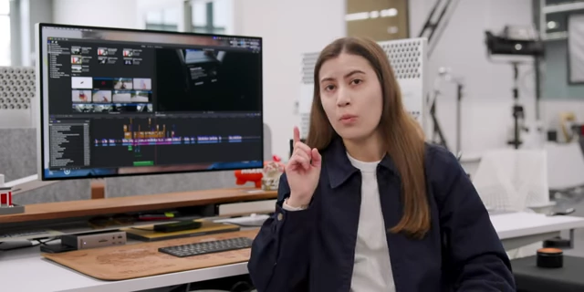
Scenario 1: Story With Too Much Footage [01:49]
- Example: Robo-taxi video [01:36]: This project had excessive footage, making subtraction key.

Timeline view showing scripted A-roll and on-site B-roll [ 00:01:55 ] - Workflow for too much footage [02:00]:
- Sync and review all footage from multiple cameras to decide what to keep or discard.

Footage selection showing 102 clips selected from a robo-taxi shoot [ 00:02:04 ] - Keep drafts of all footage to allow for revisiting decisions later.

Project drafts list for Robataxi video versions [ 00:02:13 ] - Color and label everything on the timeline to visualize usage and avoid over or under-utilization.

Timeline with color-coded footage to manage usage [ 00:02:20 ]
- Sync and review all footage from multiple cameras to decide what to keep or discard.
- Problem: Over-reliance on script [02:29]: Initially, Mariah tried too hard to force A-roll (Marques talking) with B-roll (on-site footage), leading to a confusing mix of present and past tense.

Marques' script with "intercut commentary" instruction that caused editing challenges [ 00:03:19 ] 
Timeline showing a mix of past and present tense footage causing a disjointed narrative [ 00:03:35 ] - Importance of feedback [03:44]: Editors, knowing all the footage, can miss clarity issues. Sharing cuts with others provides fresh perspectives.

Slack message requesting feedback on a video cut [ 00:03:56 ] - Removing irrelevant scenes [04:16]: A scene about Marques losing his phone in a robo-taxi was removed.

Robo-taxi screen displaying "Remember to take your belongings" after Marques lost his phone [ 00:04:43 ] - Decision-making for cuts [05:00]: Evaluate if a scene adds value to the audience or distracts from the main message. In an informational video, entertaining but irrelevant content should be cut.
- Workflow for too much footage [02:00]:
Scenario 2: Story With Too Little Footage [05:18]
- Example: "How I pick videos" [05:24]: This project was challenging due to its non-visual nature.

Timeline view of 'How I pick videos' using archive footage to compensate for lack of new visuals [ 00:05:32 ] - Avoiding "tell, don't show" [06:07]: The worst thing is to only tell without showing.
- Revising the intro [06:31]: The initial intro felt slow. A re-edit added momentum.
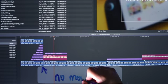
Timeline section marked "no momentum" in the first intro draft [ 00:06:44 ] - Montages and audience expectation [07:10]:
- A good intro not only hooks the audience but also sets expectations (e.g., showing a clip is from "11 years ago" manages perception).

Archive footage from 11 years ago with a timestamp to manage viewer expectation [ 00:08:01 ]
- A good intro not only hooks the audience but also sets expectations (e.g., showing a clip is from "11 years ago" manages perception).
- Transitional music [08:08]: Simple music can uplift a video, help move things along, and provide context. It should convey something not already told visually and set the tone or expectations.

Timeline showing the placement of transitional music segments [ 00:08:43 ]
Color Grading With Vinh [09:58]
Vinh, the art director, explains color grading, focusing on prep, LUTs, and plugins. He uses DaVinci Resolve but notes principles apply to any editor.

Prepping for Color [10:21]
- On-camera importance [10:43]: 80% of the image quality should be achieved on camera; only the last 20% is color grading. Bad lighting cannot be fixed in post-production.

Before color grade, Marques is seen with a blue cast over the background [ 00:10:24 ] 
Sky panels used to create the blue background lighting effect [ 00:10:32 ] - Shooting in Log [10:52]: Always shoot in log format, and preferably with a 10-bit codec (8-bit offers less dynamic range and flexibility).

Camera settings showing 10-bit log recording format on a Canon R5ii [ 00:10:53 ] 
Camera settings showing XF-AVC YCC422 10 bit format on a Canon C70 [ 00:10:57 ]
LUTs (Lookup Tables) [11:06]
- Definition [11:07]: LUTs are essentially filters applied to footage.
- Camera-specific issues [11:41]: Default conversion LUTs from camera manufacturers (e.g., Canon, Sony) often don't account for the subtle differences in log profiles across their various cameras, leading to inconsistent results.

Comparison of different Canon cameras with the same Canon LUT showing inconsistent color profiles [ 00:11:47 ] 
Comparison of different Sony cameras with the same Sony LUT showing inconsistent color profiles [ 00:12:00 ] - Preferred LUTs [12:04]: Vinh prefers LUTs from Red or Arri, or even custom YouTuber LUTs that are specifically catered to particular cameras.
- Example: Tyler Stalman's LUTs [12:16]: These are based on Arri's color space, offering a more stylized, saturated look that requires less post-processing.

Marques' footage after applying Tyler Stalman's custom LUT [ 00:12:22 ] - Basic adjustments [12:36]: Adjust exposure (offset tab in a three-wheel editor) if the image is underexposed, and fine-tune saturation.

Three-wheel color editor in DaVinci Resolve showing offset, gain, and gamma controls [ 00:12:42 ]
Our Favorite Coloring Plugin: Dehancer [12:47]
- Cost and features [12:50]: Dehancer is a professional plugin (around $400 for two seats) that offers camera-specific conversions, ensuring accurate color interpretation for different camera models.
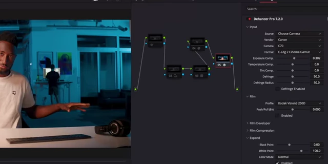
Dehancer plugin interface with camera and log profile selection [ 00:12:58 ] - Workflow [12:57]: Select the specific camera and log profile (e.g., C70, CLOG 2 Cinema Gamut) in Dehancer for a better starting point than stock LUTs. Adjust exposure and saturation as needed.

Marques' footage with Dehancer applied, before stylistic effects [ 00:13:16 ] - Stylistic effects [13:25]: Dehancer includes stylistic effects like:
- Halation [13:32]: Adds red fringing to highlights, creating a retro, warmer look.

Marques' footage with the Halation effect adding red fringing to highlights [ 00:13:33 ] - Bloom [13:42]: A diffusion filter that can be dialed in post, simulating film stock (e.g., 8mm for a softer look, 70mm for modern).
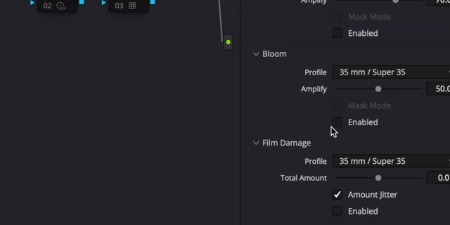
Dehancer plugin Bloom settings with film stock options [ 00:13:45 ] 
Dehancer Bloom profile options showing different film stocks (8mm, 16mm, 35mm, 70mm) [ 00:13:56 ]
- Halation [13:32]: Adds red fringing to highlights, creating a retro, warmer look.
- Stylization during production [14:17]: Stylized looks must be planned and partially achieved during production; post-production cannot create what wasn't there.
- Purpose of color grading [14:24]: Color grading should always serve the project's story and overall aesthetic.
Animation with Michael (Head of Motion Design) [14:41]
Michael, the head of motion design, breaks down the animation process. (Note: Due to "lost footage," he is represented by a cartoon avatar for this section).

Prioritizing Design [15:21]
- Illustrator first [15:21]: Michael spends more time creating flat static graphics in Adobe Illustrator than animating them.

Illustrator workspace showing basic geometric shapes for motion graphics [ 00:15:22 ] - Vector paths [15:41]: Using vectorized paths allows independent movement of elements without quality loss.

Illustrator showing vectorized paths for independent element movement [ 00:15:47 ] - Oversimplification for clarity [16:18]: Screenshots of interfaces (like YouTube or Final Cut Pro) are oversimplified to highlight only the essential elements relevant to the message, preventing viewer distraction from too much detail.

Cartoon Michael pointing out essential elements in a simplified Final Cut Pro interface [ 00:16:47 ] - Transfer to After Effects [16:59]: Uses a plugin called Overlord to seamlessly transfer Illustrator designs to After Effects.
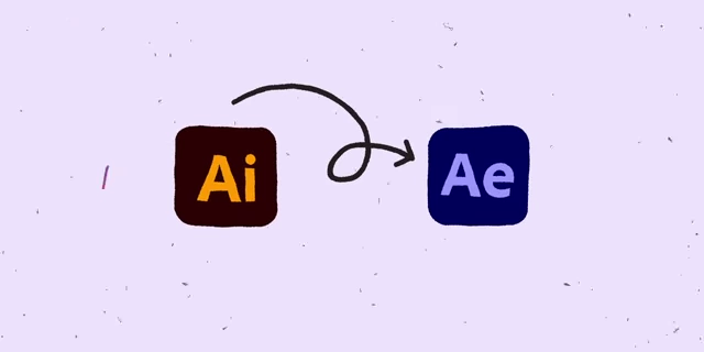
Graphic illustrating the seamless transfer from Adobe Illustrator (Ai) to Adobe After Effects (Ae) [ 00:17:02 ]
Michael's Top 3 Principles of Animation [17:13]
- Easing [17:25]:
- Concept [17:34]: Makes movement feel lifelike and real, with objects starting slow, accelerating, and ending slow.
- Application [18:04]: Applied to every keyframe in the video to ensure natural movement.

After Effects timeline showing an object moving without easing (robotic movement) [ 00:17:44 ] 
After Effects timeline showing an object moving with easing (fluid movement) [ 00:17:56 ] 
Comparison of an object moving with and without easing for a visual demonstration [ 00:18:02 ] 
After Effects graph editor showing complex easing curves for precise animation control [ 00:18:08 ] - Tool: Motion Studio Plugin [18:26]: This plugin for After Effects simplifies precise easing adjustments, offering a more efficient alternative to manual graph editor manipulation.

Motion Studio plugin interface showcasing its features for motion design [ 00:18:32 ] 
Motion Studio plugin showing numerical easing adjustments in After Effects [ 00:18:52 ] 
Motion Studio plugin's ultimate animation toolkit grid, displaying various functions [ 00:19:16 ]
- Timing [19:24]:
- Concept [19:28]: Ensures that visual beats align perfectly with spoken words, preventing disconnect or delay that can confuse viewers.
- Example [19:42]: Shifting a spotlight and eyeballs from one screen to another precisely when the speaker mentions "other person's content."

After Effects timeline showing spotlight and eyeball animation for precise timing with narration [ 00:19:48 ]
- Staging [20:05]:
- Concept [20:06]: Intentionally guides the viewer's eye to specific elements on screen, especially when combining visuals with spoken dialogue.
- Application [20:24]: Introduce elements sequentially (shapes, then YouTube video, then timeline) and use visual cues like spotlights to direct focus, preventing visual overload.

After Effects timeline showing sequential introduction of elements for effective staging [ 00:20:30 ] 
After Effects timeline showing a spotlight effect to guide the viewer's eye to specific elements [ 00:21:11 ] - Goal [21:17]: Make it as easy as possible for the viewer to understand the information without strain.
Michael’s Favorite Effects [21:23]
- Glow effect [21:28]: Adds energy and brand consistency to graphics. It should be used subtly and intentionally, often duplicated and fine-tuned.

Subtle glow effect applied to a shape in After Effects [ 00:22:01 ] - Turbulence Displace + Wiggle expression [22:03]:
- Effect [22:08]: Creates a hand-drawn, stop-motion-like look on clean vector shapes.
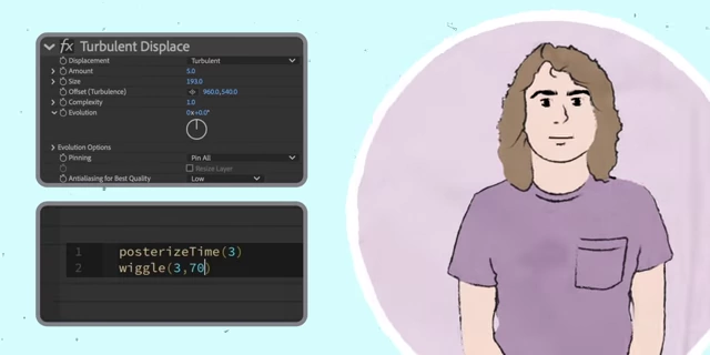
Turbulence Displace effect settings and wiggle expression in After Effects [ 00:22:09 ] 
Example of a hand-drawn look achieved with Turbulence Displace and Wiggle expression [ 00:22:14 ] 
Comparison of a plain circle versus a circle with a hand-drawn look using Turbulence Displace [ 00:22:20 ] - Mechanism [22:24]: Turbulence displace gives shapes a slight, randomly generated wobble. The "posterizeTime[3]; wiggle(3,150)" expression makes this wobble change every 3 seconds by 150 points, creating a dynamic, imperfect outline.
![Wiggle expression code "posterizeTime[<a href="https://youtube.com/watch?v=eNgD1kg3U14&t=3">3</a>]; wiggle(3,150)" used in After Effects](https://storage.googleapis.com/summarizer-images/images/eNgD1kg3U14/sc0262_t00.22.51.webp)
Wiggle expression code "posterizeTime[<a href="https://youtube.com/watch?v=eNgD1kg3U14&t=3">3</a>]; wiggle(3,150)" used in After Effects [ 00:22:51 ]
- Effect [22:08]: Creates a hand-drawn, stop-motion-like look on clean vector shapes.
- Good design is invisible [23:18]: The ultimate goal is for viewers to absorb information effortlessly, without noticing the underlying animation complexity.

Final animation example featuring glowing shapes and dynamic movement [ 00:23:27 ]
Picking Music with Ellis [23:33]
Ellis discusses the importance of music selection in video production.

- Audience resonance [24:10]: When choosing music, prioritize songs that will personally resonate with your viewers, not just what you like. Music should convey a mood, tone, or expectation that isn't already expressed visually.
- Bebop rhythm sections [23:51]: The MKBHD channel often uses uptempo jazz rhythm sections as underscore for a "frenetic," "behind-the-scenes," or "industrious" sound, which viewers subconsciously associate with such content.

A drummer playing a bebop rhythm section, used as an example of a specific music style [ 00:24:02 ] - Strategic music use [08:31]: Marques generally prefers music running for no more than 20-30 seconds to avoid making videos feel like ads, especially for product reviews. Music is best used as a transitional element to signal a shift in content.
Saving Hours with Rufus (Recording Audio) [25:21]
Rufus, who records most of the MKBHD videos, emphasizes how proper audio recording saves editing time.

Microphone Placement is Key [25:58]
- "Hear like a microphone" [26:15]: Unlike the human brain, microphones don't filter out background noise. You must strategically place the mic.

Graphic illustrating proper microphone placement: "What You Want to Hear" [ 00:26:24 ] - Proximity over direction [26:40]: A microphone pointed the wrong way but close to the source will perform better than one far away pointed correctly.

Rufus holding a microphone close to demonstrate the importance of proximity [ 00:26:44 ] - Identifying and avoiding noise sources [27:16]:
- Air conditioner [27:19]: Avoid pointing the microphone upwards if the AC is on the ceiling.

Air conditioner unit visible on the ceiling, identified as a potential noise source [ 00:27:20 ] 
Diagram showing how the air conditioner's noise sphere interferes with microphone pickup [ 00:27:23 ] - Lights with fans [27:30]: Keep the microphone away from noisy lights.

Diagram showing how the light's sound cone interferes with microphone pickup [ 00:27:33 ] - Reflective surfaces (desk) [27:42]: Avoid placing the microphone where sound can bounce off surfaces like a desk and create unwanted echoes or phasing.

Diagram showing sound reflection off a desk interfering with microphone pickup [ 00:27:46 ]
- Air conditioner [27:19]: Avoid pointing the microphone upwards if the AC is on the ceiling.
- Ideal placement [27:58]: Position the microphone's pickup pattern (e.g., a shotgun mic's cone) directly at the desired sound source while avoiding all noise sources.

Overhead diagram showing optimal microphone placement avoiding light, AC, and desk reflections [ 00:27:37 ] 
Final microphone placement diagram showing the mic's cone aimed at the subject, away from noise [ 00:28:00 ]
Common Questions About Recording Audio (Lightning Round) [28:10]
- Recording levels [28:10]: Aim for an average of around -20 dB, with the loudest peaks around -12 dB, to prevent clipping (hitting 0 dB).

Audio recorder screen showing desired recording levels between -20dB and -12dB [ 00:28:22 ] - Low-cut filter [28:36]: Turn on a low-cut filter (often on the mic or recording device) to reduce wind noise, bumps, and rumbling, which helps dialogue clarity.

Microphone switch for the low-cut filter setting [ 00:28:41 ] 
Recording device interface showing the low-cut filter setting [ 00:28:45 ] - Shotgun microphone recommendations [28:58]:
- Entry-level [28:58]: Audio Technica AT875R is highly recommended for its quality relative to its low price.
- Mid-range [29:11]: Generally not worth the upgrade; the improvement over entry-level isn't significant enough.
- Flagship [29:19]: For serious creators, investing in high-end mics like the Sennheiser MKH416, Sanken CS-M1, or DPA 4017 offers a noticeable difference and lifetime value.

High-end shotgun microphones like the Sennheiser MKH416 and Sanken CS-M1 [ 00:29:21 ]
- Simplicity of sound recording [29:35]: The core principle is simple: point the microphone at what you want to hear and away from what you don't.
Sound Design With Ellis [29:56]
Ellis explains how sound design enhances video believability and emotional impact.
Rule 1: Things That Move Probably Make a Sound [30:11]
- Example: OnePlus 13S intro [30:16]: Animated phone movements needed sound.

OnePlus logo animation during the intro sequence [ 00:30:22 ] 
Animated phone spinning on screen during the OnePlus 13S intro [ 00:31:29 ] - Matching sound to visuals [31:06]:
- Size/Mass: Since the phone appears ginormous on screen, its movements should sound big, low-pitched, and have "mass."

An image of a large elephant used as an analogy for "big" sounds [ 00:31:25 ] - Motion: As the phone turns and moves through air, a "whoosh" sound is appropriate.
- Size/Mass: Since the phone appears ginormous on screen, its movements should sound big, low-pitched, and have "mass."
- Applying "easing" to sound [32:00]: Just like visual animation, sound should also "ease" in and out. Whoosh sounds naturally start slow and accelerate, matching the phone's animated turns.
- Responding to animation glitches [32:28]: If an animation lacks easing, choose a sound that reflects that (e.g., a "boulder" sound for an abrupt stop, rather than a whoosh).

Animated boulder sound effect used to represent an abrupt phone stop [ 00:32:49 ]
- Matching sound to visuals [31:06]:
- Intuition [33:07]: Sometimes, sound design can involve freestyle and intuition (e.g., adding a slide whistle).
Rule 2: Silence Makes a Sound [33:19]
- The illusion of silence [33:31]: Real-life environments are never truly silent. Complete silence in a video feels unnatural and painful.
- Filling "sound holes" [33:53]:
- Reverb [34:02]: Sound bounces off objects, creating reverb. Our brains subconsciously use reverb to understand a space. Using long reverb tails during quiet moments indicates a large, empty space, enhancing believability.

Animated phone with music and reverb used to fill a silent moment [ 00:34:45 ] - Ambience (Background Noise) [34:49]: Adding subtle background noises (e.g., birds chirping in an outdoor shot) injects realism, even if those sounds weren't present during filming. Good ambience goes unnoticed by the viewer, signifying its effectiveness.

Aerial shot of a racetrack from the 'fastest car in the world' video [ 00:35:30 ]
- Reverb [34:02]: Sound bounces off objects, creating reverb. Our brains subconsciously use reverb to understand a space. Using long reverb tails during quiet moments indicates a large, empty space, enhancing believability.
Rule 3: Use Sounds That Mean Stuff to Your Audience [36:12]
- Emotional connection [36:19]: Certain sounds evoke emotions or memories in an audience.

Graphic displaying Rule #3: Make Me Feel Something [ 00:36:16 ] - Example: Mid-air tracing sound [36:27]: Instead of a generic writing sound (pencil on paper, chalk), Ellis used sounds from the iconic Disney Channel intro (roadside flare, bell tree) for a mid-air tracing animation. This leverages the audience's childhood memories for an emotional connection, making the sound resonate deeply without being consciously noticed.

Examples of common writing sounds like "pencil on paper" and "chalk on chalkboard" [ 00:36:50 ] 
Disney Channel intro showing mid-air tracing animation [ 00:37:19 ] 
OnePlus intro featuring mid-air phone tracing animation [ 00:37:38 ] - Goal of sound design [37:53]: Sound design is successful when it goes unnoticed, seamlessly enhancing the viewer's experience without drawing attention to itself.
Marques' Advice to Creators [38:07]
Marques Brownlee shares his insights on choosing video topics and creative approach.

- Criteria for video topics [39:25]:

Question graphic: How do you decide if a video is worth the audience's time? [ 00:39:26 ] - Looking backward to look forward [39:41]: Review past video performance and reception to identify successful themes (e.g., robotic hand review connected to past prosthetic videos).

YouTube video thumbnail for 'Reviewing a Bionic Hand!' [ 00:39:44 ] 
Screenshot from 'How 3D Printing Changed This Dog's Life!' showing a dog with a prosthetic leg [ 00:40:04 ] - Connecting tech to everyday life [40:50]: Videos, even if seemingly niche, should connect to how technology affects the average person in the future. If this connection cannot be made, Marques typically passes on the opportunity.

Screenshot from 'I Said Yes to Every Email for a Month!' video [ 00:40:54 ] - Avoiding direct copying [41:17]: A common mistake for new creators is to copy what works on other channels one-for-one. This gives viewers no reason to watch new content over existing, successful content.

Comparison of a YouTube video idea versus a direct copy, illustrating why one-for-one copying is ineffective [ 00:41:28 ] - Recommendation [41:35]: Create your own interpretation or draw from diverse inspirations.
- Moving beyond "list" videos [41:42]: Marques stopped doing "top 5" or "top 10" videos because while they optimized for attention and were easy to produce, they didn't provide as much value as he hoped. He aims to help viewers learn and experience gadgets, rather than just be entertained.

YouTube search results showing various 'Top 5' list videos [ 00:41:54 ] - Avoiding burnout [42:29]: Constantly chasing past success on YouTube can lead to burnout. Creators should prioritize making what they enjoy as much as what previously performed well.