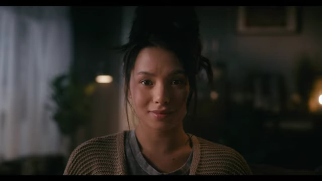
Achieving Color Consistency in Commercial Shoots: A DaVinci Resolve Workflow for Matching Discrepant Footage
This video demonstrates a methodical approach to achieve color consistency across commercial shots in DaVinci Resolve, especially when on-set changes lead to discrepancies.
- The first wide shot is graded to establish a "moody" look, adjusting exposure, white balance, and isolating the subject with power windows.
- Skin tones are verified using scopes to ensure accuracy.
- The established grade is then applied to a second, close-up shot, revealing significant differences in contrast ratio and temperature due to on-set lens and diffusion changes.
- The close-up is meticulously matched to the wide shot by adjusting exposure, white balance, and saturation, focusing on making skin tones and overall ambience consistent.
- Cosmetic refinements like digital diffusion, skin smoothing, and eye brightening are applied to the actor's face for a polished look.
- The video emphasizes understanding on-set discrepancies (lens, diffusion changes) to inform grading decisions, using tools like the Odyssey spot for technical analysis, and maintaining a pleasing key-to-fill ratio for continuity while accepting inherent differences between wide and close-up lighting.
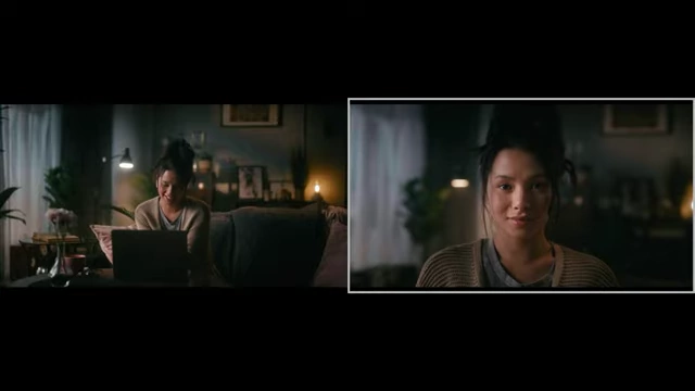
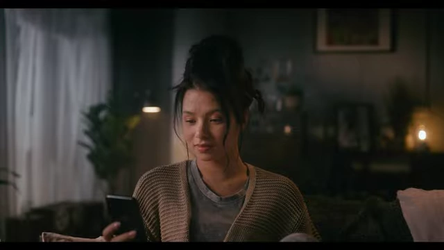
Side-by-side comparison of the two final graded shots, demonstrating visual consistency [ 00:09:13 ]
Initial Shot Assessment and Mood Setting [0:00]
The video begins by introducing two commercial shots of a woman using a laptop, which will be color graded for consistency.
- The goal is to achieve a "moody" aesthetic, suitable for a tech company commercial.
- The footage is first converted to Rec. 709.
- First shot (wide) is analyzed and graded:
- Initial exposure is adjusted by slightly darkening the image [0:51].
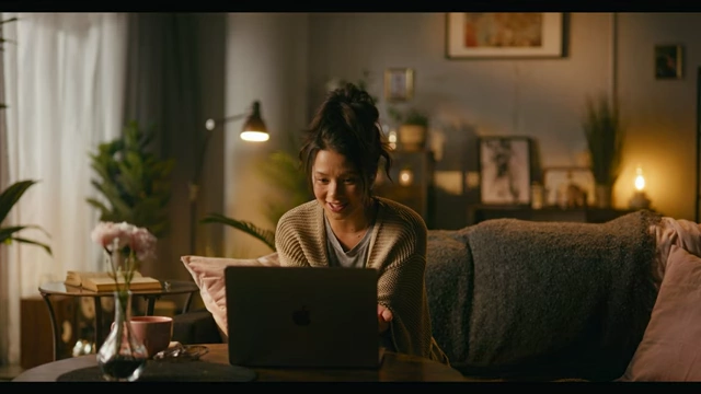
Initial wide shot before any adjustments [ 00:00:56 ] - White balance is set for a film emulation look, introducing subtle blues [0:58].
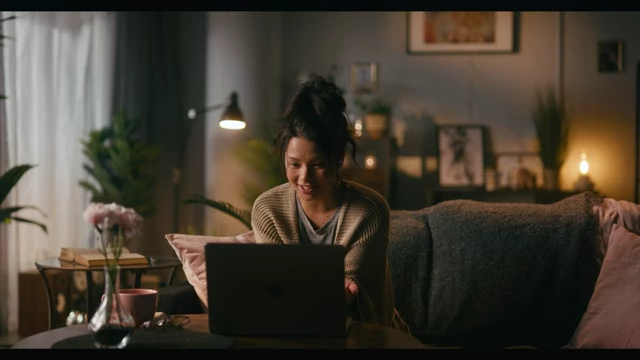
Wide shot after initial exposure and white balance adjustments for a moody, film-like feel [ 00:01:11 ] - Ambience is further reduced using a large circular power window to draw focus to the subject [1:32].
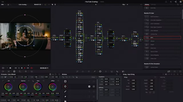
DaVinci Resolve interface showing a circular power window being applied to reduce ambience around the subject [ 00:01:40 ] - The result of the power window application helps to focus attention on the subject [1:54].
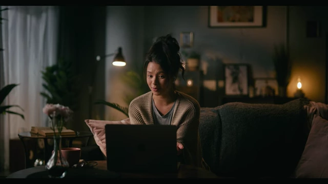
Wide shot after applying a circular power window to darken the surrounding ambience [ 00:01:57 ] - Shadows are slightly lifted to refine the overall look [2:24].
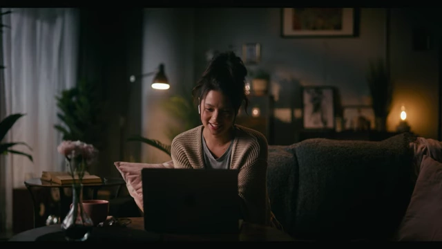
Final graded wide shot, showing refined exposure, white balance, and mood [ 00:02:21 ]
- Initial exposure is adjusted by slightly darkening the image [0:51].
- Skin tone analysis:
Identifying and Explaining Inconsistencies [2:34]
After applying the first shot's grade to the second (close-up) shot, significant inconsistencies are immediately visible.
- Visual comparison:
- The close-up shot initially appears noticeably darker and warmer than the wide shot, even after applying the same grade [2:36].
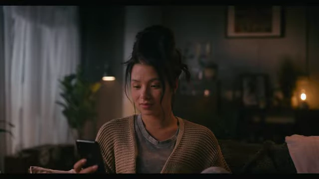
Close-up shot after the wide shot's grade has been applied, revealing noticeable discrepancies [ 00:02:37 ] - A side-by-side comparison of the two shots reveals clear differences in contrast, temperature, and overall exposure [2:47].
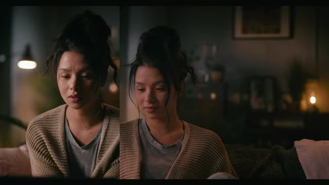
Split screen comparing the graded wide shot (right) and the close-up shot (left) before matching, highlighting discrepancies [ 00:02:50 ]
- The close-up shot initially appears noticeably darker and warmer than the wide shot, even after applying the same grade [2:36].
- Causes of discrepancy:
- These inconsistencies are attributed to standard on-set practices in cinematography and gaffing.
- Lens changes: Swapping lenses for different shot types (wide vs. close-up) can introduce variations [3:21].
- Diffusion changes: Using thicker diffusion for close-ups to flatter the actor can reduce key-side intensity and cause a temperature shift [3:24].
- Cinematographers often light wide shots with higher contrast to shape the scene, while close-ups aim for a softer, more flattering look on the actor [10:30].
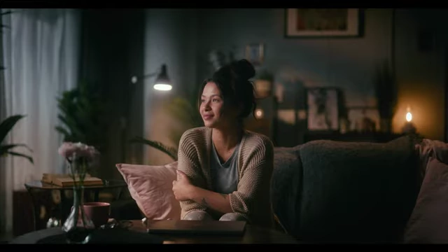
The original wide shot demonstrating its higher contrast ratio for scene shaping [ 00:10:35 ] 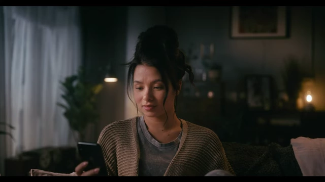
The original close-up shot illustrating a softer, more flattering look on the actor [ 00:10:56 ]
Matching the Second Shot to the First [4:10]
The process involves adjusting the close-up shot to visually match the mood and characteristics of the wide shot, maintaining continuity.
- Exposure adjustment:
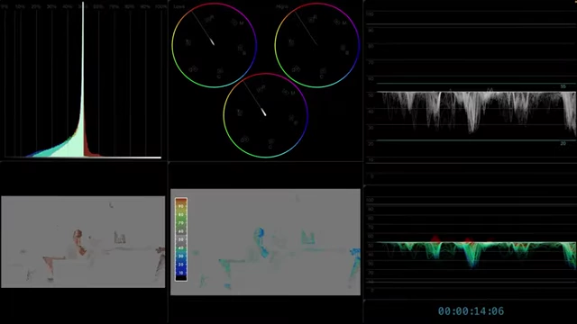
- Scopes are used to compare the exposure levels between the two shots, showing the close-up (left) is significantly underexposed [4:17].
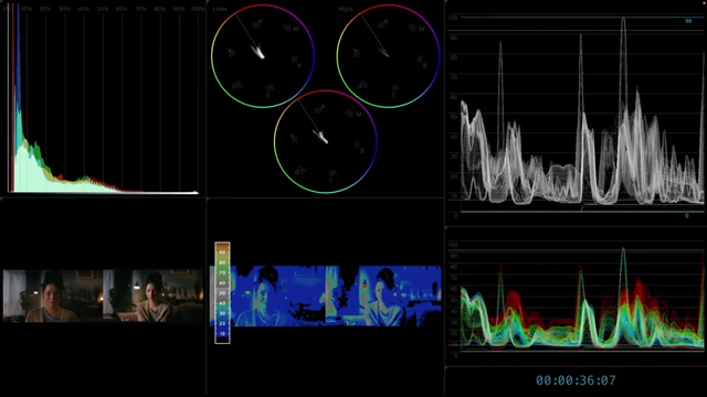
DaVinci Resolve scopes showing waveforms for both the wide (right) and close-up (left) shots, highlighting exposure differences [ 00:04:19 ] - Exposure is increased on the close-up to align it with the wide shot [4:42].
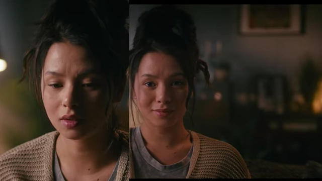
Split screen showing the close-up (left) after exposure adjustment, next to the wide shot (right) [ 00:04:49 ]
- Scopes are used to compare the exposure levels between the two shots, showing the close-up (left) is significantly underexposed [4:17].
- White balance correction:
- The close-up shows additional warmth, likely from the thicker diffusion used on set.
- White balance is adjusted slightly towards yellow to counteract this warmth and bring skin tones closer to the reference [4:54].
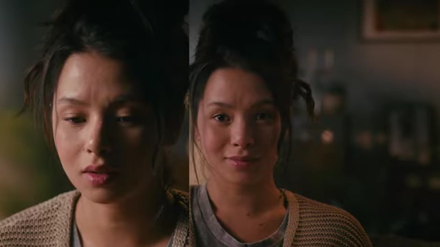
Split screen comparing the close-up (left) after white balance adjustment to the wide shot (right) [ 00:04:54 ]
- Color saturation refinement:
- Subtle adjustments are made to yellow and red saturation to further unify the skin tones [5:12].
- Dark level adjustment:
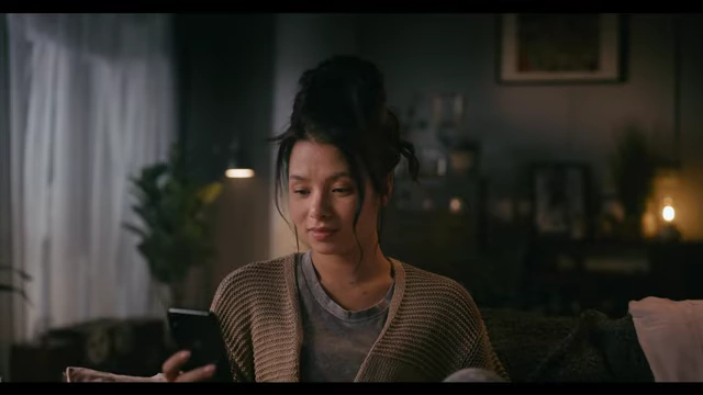
Cosmetic Adjustments and Digital Refinements [5:40]
Further enhancements are made to the actor's appearance to ensure a polished final look.
- Digital diffusion:
- Face refinement tool:
- DaVinci Resolve's face refinement tool is used for detailed cosmetic work on the actor's face [6:03].
- Skin smoothing: A subtle amount of skin smoothing is applied to soften the texture [6:19].
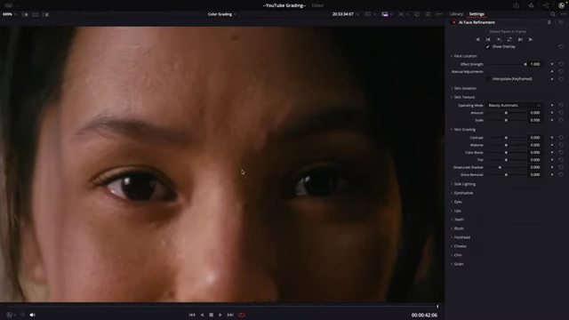
Close-up of the actor's face before skin smoothing, with DaVinci Resolve's face refinement settings visible [ 00:06:14 ] 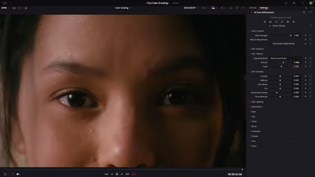
Close-up of the actor's face after subtle skin smoothing has been applied, with DaVinci Resolve's face refinement settings visible [ 00:06:44 ] - Eye brightening: The eyes are slightly brightened to make them stand out [6:50].
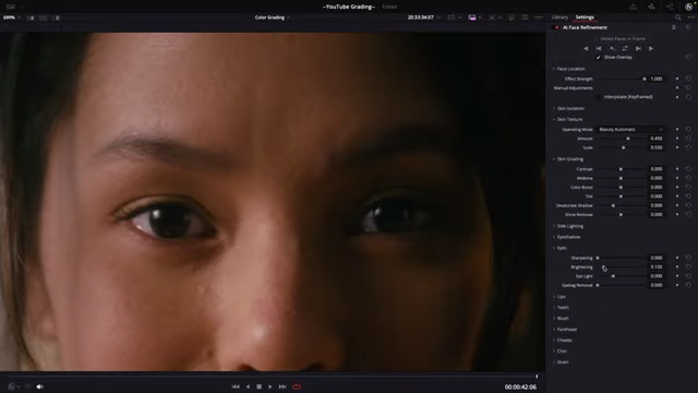
Close-up of the actor's eyes before brightening, with DaVinci Resolve's face refinement settings visible [ 00:06:54 ] 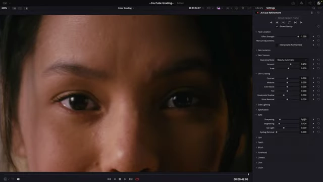
Close-up of the actor's eyes after subtle brightening, with DaVinci Resolve's face refinement settings visible [ 00:07:04 ] - Undereye softening: Undereye areas are softened to reduce any harshness [7:08].
- Grain addition: Digital grain is added back to the skin to hide the smoothing and restore natural texture [7:37].

Close-up of the actor's face after skin smoothing and grain addition to restore natural texture [ 00:07:34 ] - These cosmetic changes are copied and applied to the corresponding parts of the wide shot for consistency [8:19].
Final Touches and Key Learnings [8:32]
The final steps involve unifying the overall color balance and reinforcing the importance of being aware of on-set production choices.
- Midtone coolness:
- Contrast refinement:
- A slight contrast adjustment is applied within the circular power window [9:03].
- Overall consistency achieved:
- Understanding on-set decisions:
- Using measurement tools:
- Tools like the "Odyssey spot" in DaVinci Resolve can provide technical readouts of exposure differences between selected points in a frame, aiding in precise matching [9:57].
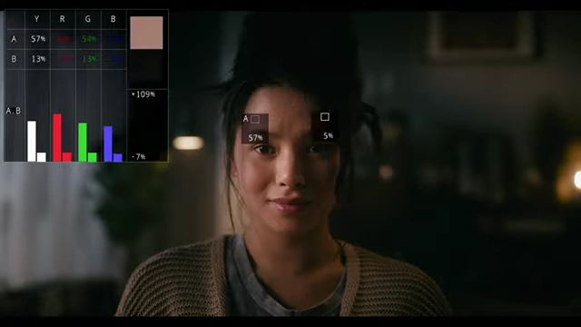
DaVinci Resolve's Odyssey spot tool displaying exposure difference readouts between two selected points on the actor's face [ 00:10:23 ]
- Tools like the "Odyssey spot" in DaVinci Resolve can provide technical readouts of exposure differences between selected points in a frame, aiding in precise matching [9:57].
- Key to fill ratio:
- It's important to pay attention to the key-to-fill ratio as it often changes from wide to close-up shots; close-ups typically have a softer, less contrasted look for flattering subjects [11:01]. The casual viewer won't notice these technical differences as long as the overall "feel" of the images is consistent [11:35].