How Professionals Guide Viewer Attention with 5 Color Grading Principles in DaVinci Resolve
This video explains how to use artistic color grading in DaVinci Resolve to guide a viewer's eye. The core idea is to direct or redirect attention to specific parts of an image using five key principles: brightness, contrast, saturation, sharpness, and color contrast. The tutorial demonstrates these techniques on a sample image, creating power windows (masks), adjusting each principle to highlight subjects and de-emphasize backgrounds, and then blending the effects. The video concludes by showing how to track these windows for moving shots and refine the overall look using curves.
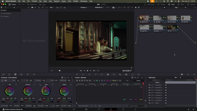
Introduction to Artistic Color Grading [0:00:35]
The video shifts focus from the technical aspects of color grading in DaVinci Resolve to the artistic side, emphasizing decision-making in achieving a desired look.
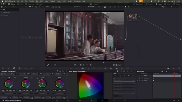
- The primary goal of every color grading decision is to focus or redirect viewer attention to specific parts of an image.
- The tutorial will demonstrate a five-step system to simplify decision-making in color grading.

Original image in DaVinci Resolve with main subjects boxed, indicating the initial focus [ 00:03:10 ]
The 5 Principles of Eye Guidance [0:01:46]
There are five main elements that help guide a viewer's attention within an image:
- Brightness: The human eye is first attracted to the brightest object.
- Contrast: Eyes are drawn to areas with the highest contrast.
- Saturation (Color Intensity): Areas with more vibrant saturation attract more attention.
- Sharpness: Sharper areas naturally stand out against blurrier ones.
- Color Contrast: Warm colors (orange, red, yellow) attract attention more readily than cool colors (blues, greens).
Applying Brightness Controls [0:03:03]
The tutorial demonstrates controlling brightness to direct attention to the two main subjects in a pharmacy scene.
- Identifying distracting bright areas: Several parts of the background (e.g., a bright section, a window, ceiling) compete for attention.
- Establishing a line of attention: The composition naturally guides the eye along an imaginary line toward the subjects.

DaVinci Resolve showing the desired line of attention over the subjects [ 00:04:00 ] - Creating a mask for the main subjects: A polygonal window is drawn around the two persons to isolate them.
- An "outside node" is added to affect areas outside the mask.
- Feathering is applied to the mask for smooth transitions.

DaVinci Resolve interface demonstrating node setup and mask creation for the main subjects [ 00:05:43 ]
- Darkening background elements:
Gammais used to reduce brightness more naturally in the outside node, preserving shadow detail, avoiding information loss seen withOffset.
DaVinci Resolve interface showing darkened background after brightness adjustments [ 00:08:39 ]
- Identifying and dimming overly bright spots:
- A technique using
Pivotcontrol is shown to reveal the brightest areas in white, helping identify remaining distracting elements.
DaVinci Resolve displaying the brightest areas in white to identify distractions [ 00:10:39 ]
- A technique using
Applying Contrast Adjustments [0:12:21]
Contrast is used to further guide the eye by making the focal points more distinct.
- Increasing contrast for subjects: In the node controlling the main subjects, contrast is slightly increased using the contrast and pivot controls.
- Reducing contrast for background: In nodes controlling background areas, contrast is slightly reduced by adjusting
Gaindown andLiftup independently to control highlights and shadows.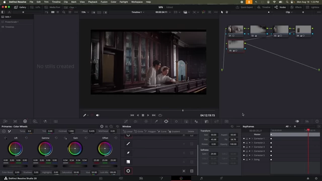
DaVinci Resolve interface after contrast adjustments, highlighting subjects [ 00:12:09 ]
Manipulating Saturation for Focus [0:16:58]
Saturation is adjusted to make focal points more vibrant and less important areas less distracting.
- Increasing saturation for subjects: The saturation of the main subjects is slightly increased.
- Reducing saturation for background: The saturation of the background elements is slightly decreased.
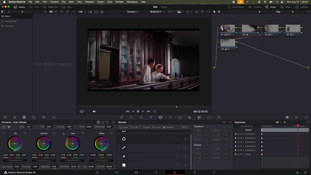
DaVinci Resolve interface after saturation adjustments [ 00:17:18 ]
Refining with Sharpness [0:17:30]
Subtle sharpness adjustments further enhance the visual hierarchy.
- Increasing sharpness for subjects: The sharpness for the main subjects is slightly increased.
- Subtly blurring background: For areas that are not the main focus, a slight blur is added (by increasing
Blurin the sharpness controls) to softly push them into the background.
DaVinci Resolve interface after applying subtle blur to background elements for sharpness control [ 00:17:42 ]
Utilizing Color Contrast (Warm vs. Cool) [0:17:55]
Color contrast leverages the psychological effect of warm and cool colors.
- Applying cool tones to background: The outside nodes are adjusted to introduce cooler tones (blues or greens) using
Offsetcontrols.
DaVinci Resolve interface with cool blue tones applied to the background [ 00:18:58 ] - Applying warm tones to subjects: The main subject node is adjusted to introduce warmer tones (yellows or oranges) using
Gaincontrols.
DaVinci Resolve interface showing strong warm tones applied to the subjects [ 00:21:20 ] - Overall powerful look: The goal is to create a strong, "in-your-face" look that can then be dialed back for a more natural feel.

DaVinci Resolve interface showing the powerful, over-the-top initial look before refinement [ 00:21:27 ]
Blending and Refining the Look [0:21:47]
After creating a powerful initial look, the next step is to blend and refine it for naturalness.
- Softening mask edges: The harsh edges of the initial masks are further softened using increased
Softness(both inside and outside feathering) to ensure smooth transitions between affected and unaffected areas.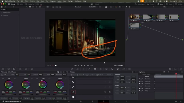
DaVinci Resolve interface demonstrating softening mask edges for seamless blending [ 00:22:27 ] - Adjusting overall contrast and brightness: Minor tweaks to contrast and brightness are made to the subject area to ensure it doesn't appear overdone and blends seamlessly.
- Using Curves for final touches:
Luma vs. Saturation: Used to desaturate shadows and fine-tune saturation across different brightness ranges, especially for skin tones.
DaVinci Resolve interface showing Luma vs. Saturation curve adjustments [ 00:24:38 ] Saturation vs. Saturation: Controls saturation based on existing saturation levels, allowing reduction in overly saturated areas and increase in undersaturated ones.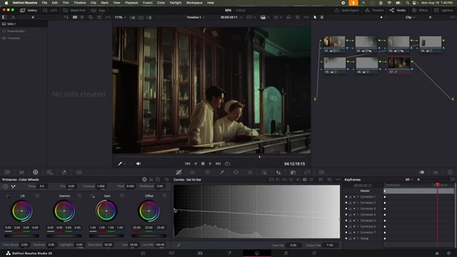
DaVinci Resolve interface showing Saturation vs. Saturation curve adjustments [ 00:26:10 ] - The final result after blending and curve adjustments creates a more appropriate and natural look.
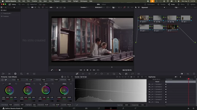
DaVinci Resolve interface showing the final refined look before tracking [ 00:26:17 ]
Tracking Windows for Dynamic Shots [0:26:27]
For moving footage, the applied windows need to follow their respective subjects or areas.
- Manual keyframing vs. tracking: While DaVinci Resolve has excellent tracking capabilities, manual keyframing in "frame mode" can sometimes be preferred for precise control, especially for complex or short movements.
- Setting keyframes: Keyframes are added at different points in the clip, and the power windows are repositioned at each keyframe to follow the movement of the subjects or areas.
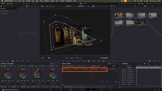
DaVinci Resolve timeline showing multiple keyframes for manual window tracking [ 00:28:26 ] - Ensuring consistent effects: By tracking the windows, the color grading adjustments (brightness, contrast, etc.) remain correctly applied to the intended areas throughout the clip, maintaining the directed attention.
- The final comparison shows the significant transformation from the original to the graded image, effectively guiding the viewer's eye.
Side-by-side comparison of the original (left) and final graded (right) image [ 00:32:46 ]
- The final comparison shows the significant transformation from the original to the graded image, effectively guiding the viewer's eye.