Understanding Color Theory and Practical Lightroom Editing for Photographers
Summary:
- Color is crucial in photography, impacting aesthetics, mood, and storytelling. Mastering it involves understanding its core components and psychological effects.
- The fundamental elements of color are Hue (the color itself), Saturation (purity/intensity), and Luminance (brightness). These can all be adjusted in editing software.
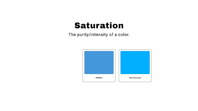
Diagram showing saturation levels of blue [ 00:01:40 ] 
Diagram showing luminance levels of green [ 00:02:00 ] - Temperature dictates if colors are warm (orange, yellow) or cool (blue, purple), significantly altering a photo's feel.

Color bar showing warmer and cooler colors [ 00:02:40 ] - Color spaces like sRGB (recommended for wider compatibility) and Adobe RGB (wider gamut, less compatible) affect how colors appear online and in print.

Diagram of RGB color model and different color spaces [ 00:03:40 ] - The psychology of color connects specific hues to emotions, allowing photographers to manipulate colors to convey deeper stories.

Chart showing colors and associated emotions [ 00:05:00 ] - Color Harmony describes how colors aesthetically relate, with key schemes including analogous (adjacent on color wheel), monochromatic (variations of one hue), and complementary (opposite hues, creating contrast).

Color wheel showing different color harmonies [ 00:07:00 ] - Lightroom offers powerful tools like the HSL sliders, Color Grading panel, and Masking tools for precise color adjustments, enabling targeted enhancements to achieve desired moods and harmonious palettes.

Lightroom panels for color adjustment [ 00:18:20 ] - Taking breaks during editing is vital to prevent color fatigue and ensure accurate color perception.
Introduction to Color in Photography [00:00]
Color is a paramount aspect of photography, significantly influencing not just the aesthetic but also the mood, story, and feeling conveyed in an image.
- Photographers often spend extensive time perfecting colors to evoke specific emotions and narratives within their work.
- Mastering color, particularly in the editing phase, is a challenging but rewarding skill.
Foundations of Color Theory [01:04]
Understanding the basic principles of color is essential for photographers to manipulate and enhance their images effectively.
- Anatomy of Color [01:12]
- Hue: The actual color (e.g., green, blue, yellow, orange).
- Saturation: The purity or intensity of a color.
- Luminance: The brightness of a color.
- Adding white makes a color brighter and less saturated.
- Adding black makes a color darker and more saturated, often increasing saturation.
Diagram showing luminance levels of green [ 00:02:00 ]
- Temperature [02:29]
- Refers to whether colors appear warmer (orange, yellow) or cooler (blue, purple).
- Adjusting temperature can profoundly impact the look and feel of a photograph.
Color bar showing warmer and cooler colors [ 00:02:40 ]
- Color Space (RGB) [02:54]
- Digital photography primarily uses the RGB (Red, Green, Blue) additive color model, where these primary colors combine to create a broad spectrum.
- sRGB vs. Adobe RGB:
- Adobe RGB offers a wider color gamut, capturing more colors.
- sRGB is designed for screens, digital photos, and printing, offering wider compatibility across devices and online platforms.
- It is crucial to shoot and export in sRGB to avoid color shifts and issues when sharing photos online, as platforms often convert Adobe RGB to sRGB, which can distort colors and contrast.
Diagram of RGB color model and different color spaces [ 00:03:40 ]
Psychology of Color [04:26]
Color is deeply tied to human emotion and can be strategically used to tell a more meaningful story in photographs.
- Emotional Associations:
- Specific colors evoke general emotional responses, although these can vary slightly based on cultural background and personal experiences.
- Examples: Green for nature, wealth, trust; blue for natural, calming; warmer colors for fierce, energetic, strong.
Chart showing colors and associated emotions [ 00:05:00 ]
- Manipulating Emotion:
- Photographers can enhance or desaturate certain colors to strengthen the desired emotional expression.
- Example: Emphasizing warm tones in a sunset photo to convey power or drama, or leaning into cooler tones for a moody, isolated feeling.

Before/After example of emphasizing warm sunset tones [ 00:05:40 ] 
Before/After example of enhancing cool, moody tones [ 00:06:10 ]
Color Harmony [06:22]
Color harmony refers to the aesthetic relationship between colors and how pleasing they appear together. Utilizing a color wheel can help visualize these relationships.
- Adobe Color Tool [06:54]
- A useful tool for photographers to visualize and experiment with different color harmonies on an interactive color wheel.
Adobe Color interface with color wheel [ 00:07:00 ]
- A useful tool for photographers to visualize and experiment with different color harmonies on an interactive color wheel.
- Types of Color Harmony:
- 1. Analogous Colors [07:33]
- Three or more hues equally fanned out from a central color on the color wheel.
- Often found in nature (e.g., sunsets, forests, bodies of water).
- Creates a cohesive and harmonious feel.

Adobe Color showing analogous colors [ 00:07:50 ] 
Photo example of analogous colors in a sunrise landscape [ 00:08:10 ]
- 2. Monochromatic Colors [08:29]
- Different luminance (brightness) ranges of a single hue.
- Common in natural settings like sunsets, oceans, or during blue hour.
- Allows focus on a single dominant color, enhancing its psychological impact.

Adobe Color showing monochromatic blue [ 00:08:40 ] 
Photo example of monochromatic warm tones in a sunset [ 00:09:20 ] 
Photo example of monochromatic cool tones in a misty jungle [ 00:09:40 ]
- 3. Complementary Colors [10:32]
- Colors positioned opposite each other on the color wheel.
- Naturally occurring (e.g., blue sky and warm sand, red flower and green stem).
- Popular in cinema (e.g., orange and teal) because orange complements skin tones while blue provides contrasting background/shadows.
- Introduces color contrast, adding visual interest and making colors more appealing.
- Often requires minor adjustments in editing to make colors more complementary.

Adobe Color showing complementary colors (teal and orange) [ 00:11:10 ] 
Photo example with enhanced complementary blue and orange tones [ 00:12:00 ]
- 1. Analogous Colors [07:33]
Crucial Color Editing Tips for Lightroom [15:12]
Effective color editing in Lightroom involves understanding your creative vision and utilizing specific tools.
- 1. Start with Intent [15:12]
- Before adjusting, ask: "How do I want this photo to look?" and "How do I want it to feel?"

Question: How do I want this photo to look? [ 00:15:40 ] - Use the inherent colors of the image to accentuate, enhance, or desaturate elements to convey the desired mood and story.
- Example: Leaning into warm tones for a dramatic sunset or emphasizing cool tones for a solemn, isolated feel.

Before/After example of enhancing warm autumn colors [ 00:17:20 ]
- Before adjusting, ask: "How do I want this photo to look?" and "How do I want it to feel?"
- 2. Experiment with All Tools [17:57]
- There are numerous ways to achieve a specific color look in Lightroom, including:
- HSL sliders (Hue, Saturation, Luminance)
- Tone Curve
- Point Color feature
- Temperature and Tint sliders
- Color Calibration
- Color Grading panel
- Contrast adjustments
- Each image is unique, and some may require more extensive adjustments across various tools. Experiment with each slider and panel to understand its effect on your image.
Lightroom panels for color adjustment [ 00:18:20 ]
- There are numerous ways to achieve a specific color look in Lightroom, including:
- 3. Utilize the Color Grading Panel [20:05]
- A powerful tool for adding specific colors to different tonal ranges (shadows, midtones, highlights).
- Offers precise control over where and which colors are applied, going beyond basic temperature adjustments.
- Enhances color depth, emotion, and drama in images.

Lightroom Color Grading panel in action [ 00:20:30 ]
- 4. Leverage Masking Tools [21:02]
- Provides incredible creative control by allowing targeted color adjustments to specific parts of an image.
- Use radial or linear gradients, or color/luminance range masks.
- Commonly used to adjust temperature, tint, saturation, and luminance within selected areas.
- Example: Selecting the sky to enhance its tint and saturation while adding warmth to shadows using a luminance range mask to create complementary colors.

Lightroom Masking tool applying a color adjustment to the sky [ 00:21:20 ] 
Before/After example of using masking to enhance specific colors [ 00:22:10 ]
- 5. Take Breaks (Color Fatigue is Real) [22:52]
- Prolonged editing can lead to "color fatigue," making colors appear different after a break.
- Stepping away from your screen and returning with fresh eyes helps in accurately assessing and refining color adjustments.
- It's common for images to require multiple editing rounds to perfectly dial in colors.

Text on screen: Take breaks. Color fatigue is real. [ 00:23:00 ]