A Step-by-Step Guide to Designing a Brand Identity for a Coffee Shop
Summary:
This video provides a detailed, step-by-step process for creating a brand identity for "Melt London," a coffee shop targeting young, aesthetic-focused women. The comprehensive guide covers:
- Defining brand strategy, including the client's vision and target audience.

Detailed Brand Identity Roadmap [ 00:00:26 ] - Developing two mood boards and selecting one based on client feedback.
- Designing a unique logo suite, starting with customizing a "melting" wordmark in Adobe Illustrator, incorporating a negative space heart, and creating a complementary icon and horizontal wordmark.
Before and After of Melt London Wordmark Customization [ 00:07:28 ] - Refining a pastel color palette for a warm and welcoming feel, and testing for contrast.

Melt London's Refined Final Color Palette [ 00:13:33 ] - Selecting primary and secondary typography that aligns with the brand's retro aesthetic.
- Generating photography styles using AI tools like ChatGPT and Midjourney, featuring harsh shadows and everyday moments.

AI-Generated Photography Style Examples for Melt London [ 00:14:55 ] - Compiling a case study showcasing various applications like social media posts, videos, and product mockups.

Social Media Post Mockup for Melt London [ 00:16:15 ] - Finalizing the brand for client presentation and developing brand guidelines.
Introduction [00:00]
- Transitioning from Graphic to Brand Designer
- Building a brand from scratch can be overwhelming, especially when transitioning from a graphic to a brand designer.
- Many crucial pieces like messaging, look, and feel must align for intended brand perception.
- A solid process is essential to avoid design "spirals" and messy canvases.
- A clear roadmap is vital to guide designers from concept to a desirable brand.
Detailed Brand Identity Roadmap [ 00:00:26 ]
- Video Goal
- The video aims to demonstrate a complete start-to-finish process for brand creation.
- The focus is on designing a brand that is not only visually appealing but also strategically aligned with the client's target audience.
The Client [00:53]
- Melt London Coffee Shop Overview
- The project involves designing a brand for "Melt London," a new coffee shop located in London.
- The target demographic is young women who appreciate aesthetic environments, "cute lattes," and current trends (e.g., TikTok).
- The coffee shop aims to be a go-to spot where customers can work on their goals in an aesthetically pleasing space.
- Vision for the Brand
- Melt London's vision is to become the premier destination for "girl boss mornings," social catch-ups with friends, and shareable "I'm living my best life" Instagram moments.
Strategy [01:09]
- Importance of Brand Strategy
- Brand strategy is identified as the most critical phase in building a brand identity.
- It lays the fundamental groundwork that dictates all subsequent design decisions.
- Key elements to understand include business goals, mission, vision, values, and messaging.
- All strategic elements are derived from a deep understanding of the client's target audience.
- Alignment with Target Audience
- Every design choice, from the color palette to typography selections, must be entirely consistent with the identified target audience.
- Strategy Overview for Melt London
- A detailed strategy document was created for Melt London, providing a quick overview of its core tenets.
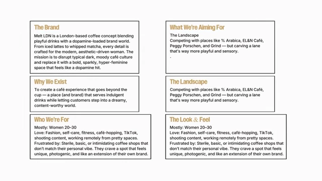
Melt London Brand Strategy Overview [ 00:01:35 ]
- A detailed strategy document was created for Melt London, providing a quick overview of its core tenets.
Moodboard [01:38]
- Moodboard Creation Process
- Two distinct mood boards were developed, each offering slightly different stylistic directions.
- To aid client understanding and prevent misinterpretation, detailed annotations were added, explaining the rationale behind each design element on the mood board.
- Client Selection and Key Elements
- The client ultimately chose Moodboard 2.
- The favored elements from the selected mood board included:
- A custom rounded wordmark.
- A warm and inviting color palette.
- A flash photography style that captures authentic, everyday moments.
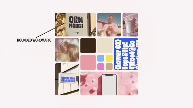
Selected Moodboard 2 with Key Elements Highlighted [ 00:02:10 ]
- Transition to Logo Suite Creation
- Following mood board approval, the next major step is the creation of the logo suite.
- The logo suite comprises an icon, a vertically stacked wordmark, a horizontal wordmark, and a badge.
- The primary focus is on developing the wordmark first, with other logo elements designed around it.
- Wordmark Customization
- Initial fonts are selected as a base for customization, knowing they will be heavily modified.
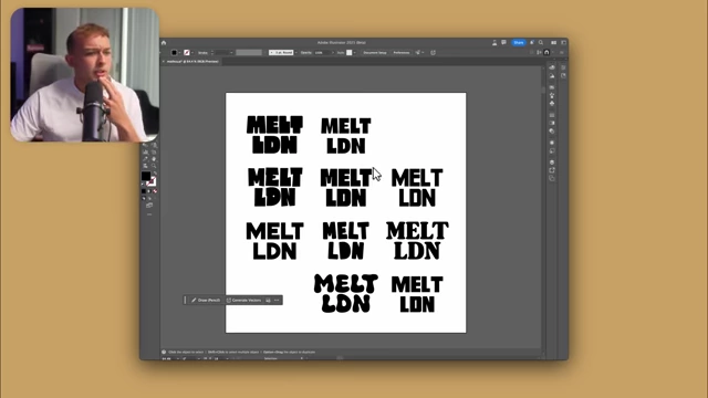
Initial Font Selection for Wordmark Customization [ 00:03:11 ] - Process in Adobe Illustrator:
- Convert text to outlines (Command + Shift + O or right-click > Create Outlines) to transform letters into editable shapes.
- Use the pencil tool (N) for freeform manipulation of the letter shapes.
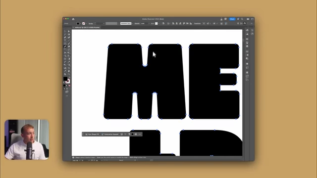
Customizing 'M' with the Pencil Tool in Adobe Illustrator [ 00:04:45 ] - The design concept involves the text appearing to "droop" down, symbolizing "Melt London."
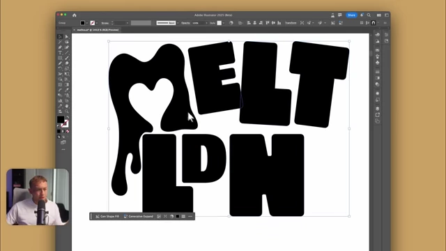
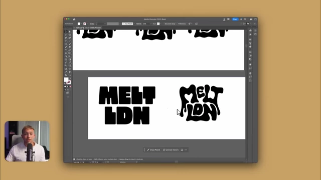
Melt London Wordmark with Dripping Effect and Negative Space Heart [ 00:06:33 ] - A subtle heart shape is incorporated into the negative space of the letter 'M' to align with the brand's identity.
- The customization involves creating multiple iterations and making copies to track evolution and allow for reversions.
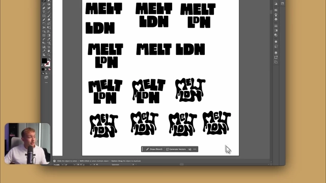
Iterations of the Melt London Wordmark Customization [ 00:06:40 ] - The final wordmark is significantly different and customized from the original font.
- Before and After of Melt London Wordmark
Before and After of Melt London Wordmark Customization [ 00:07:28 ]
- Initial fonts are selected as a base for customization, knowing they will be heavily modified.
- Adding a Border to the Logo Type
- To enhance the brand's identity and appeal to the target audience (making it feel like a "hidden gem" coffee shop), a border is added.
- Technique:
- Group all the letters (Command + G).
- Apply Object > Path > Offset Path (e.g., 10 pixels) to create an outer border.
- Utilize the Shape Builder tool to merge and refine the border shape, eliminating unwanted gaps.
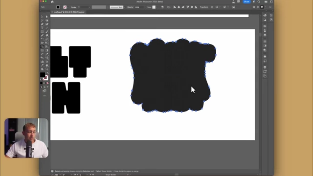
Applying Offset Path and Shape Builder for Logo Border [ 00:08:29 ] - Invert colors (e.g., dark border, light letters) for visual impact and contrast.
- Icon Design
- An icon is designed for scenarios where the full wordmark might not be legible, such as app icons, favicons, or product placements.
- The icon is derived from the 'M' of the wordmark, retaining the distinctive negative space heart.
- A unique, wavy border reminiscent of a "biscuit top" is created using the ellipse tool and the Distort & Transform > Zig Zag effect with "smooth" points.
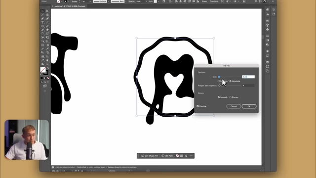
Applying Zig Zag Effect for Icon Border [ 00:09:56 ] - The icon is refined to ensure clear recognition of the 'M' and the heart.
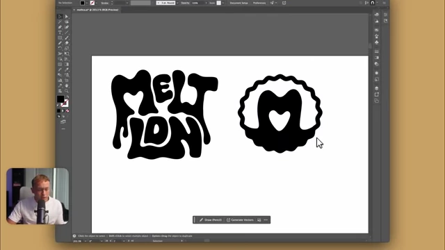
Final Melt London Wordmark and Icon [ 00:11:06 ]
- Horizontal Wordmark Creation
- A horizontal version of the wordmark is developed for broader application and versatility.
- The letters' rotation and spacing are adjusted to achieve a horizontal alignment while preserving the "melting" aesthetic and the negative space heart.
- Melt London Logo Suite

Melt London Logo Suite with Vertical Wordmark, Icon, and Horizontal Wordmark [ 00:11:36 ]
Colour [12:17]
- Developing the Color Palette
- The initial color palette is extracted and refined from the selected mood board.
- Multiple variants are explored by adjusting saturation, lightness, and hues.
- The goal is to achieve a "pastel vibe" that conveys warmth and welcome.
- A specific pink is replaced with a green, which will also be used to represent matcha lattes offered by the coffee shop.
- Final Color Palette
-
Melt London's Refined Final Color Palette [ 00:13:33 ]
-
- Contrast Testing
- The new logos are placed on squares of each color from the palette.
- This step ensures sufficient contrast and visibility for all logo variations across the chosen color scheme.
-

Melt London Logos Displayed on Various Backgrounds from the Refined Color Palette to Test Contrast [ 00:14:17 ]
Typography [14:14]
- Primary Font Selection
- The process for selecting the primary font (for headings) mirrors the logo type selection.
- A selection of fonts is gathered, and an elimination process is used.
- The same font initially chosen as the base for the logo type is selected as the primary font due to its strong alignment with the brand's mood board.
- Secondary Font Selection
- A complementary secondary font is chosen for body text and other elements. It is noted to be similar to "Poppins" but is a different typeface.
- Type System Development
- A complete type system is then developed, integrating both the primary and secondary fonts for consistent brand messaging.
-

Example of the Primary Typeface, "Hello Ldn," used for headings [ 00:14:25 ]
Photography [14:52]
- Generating Photography Style
- Photography prompts are generated using ChatGPT.
- Images are then created using Midjourney to translate these prompts into visual assets.
- The aim is to capture the desired brand vibe through the photography.
- Characteristics of the Photography Style
- The photography seamlessly integrates the chosen color palette.
- Features harsh shadows, aiming to naturally capture everyday moments.
- Embraces a retro theme, complementing the overall brand aesthetic.
- Includes playful elements, such as dogs depicted drinking coffee, to enhance the brand's welcoming and quirky personality.
-
AI-Generated Photography Style Examples for Melt London [ 00:14:55 ]
Case Study [15:49]
- Purpose and Presentation
- A case study is compiled to effectively present the complete brand identity to the client.
- It is also recommended for designers to post such projects on platforms like Behance and Instagram to grow their agency and attract clients.
- Applications and Mockups Showcase
- Social Media Usage
- Demonstrations of how typography is applied in social media posts.
- The brand icon is used in the bottom corner, and photo borders are intentionally "imperfect" to maintain consistency with the logo type.
-
Social Media Post Mockup for Melt London [ 00:16:15 ]
- Video Content
- AI-generated videos created using Midjourney's animation feature are showcased.
- These videos include animated tags and icons, demonstrating dynamic brand application.
-
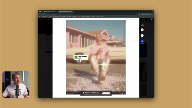
AI-Generated Video Example with Animated Brand Tag [ 00:17:04 ]
- Product Mockups
- Mockups are created using Midjourney for AI generation and Photoshop for applying logos.
- This method ensures high consistency with the overall brand image and style.
- The brand icon is shown being used as a stamp on packaging.
-
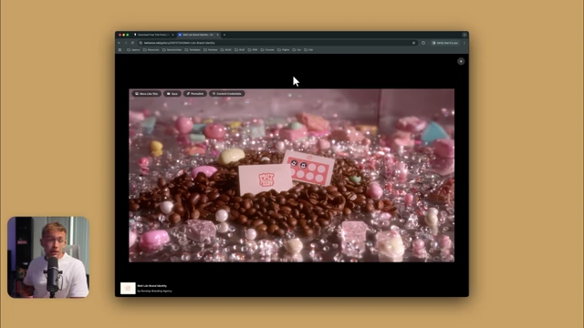
Product Mockup Showing Melt London's Logo on Coffee Packaging [ 00:17:19 ]
- Digital Mockups
- Examples include a phone mockup featuring the Melt London logo.
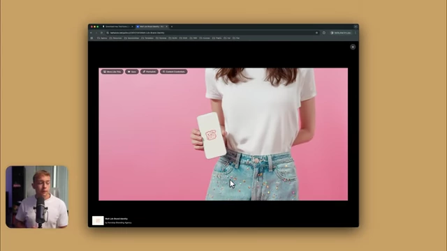
Phone Mockup Featuring the Melt London Logo [ 00:17:44 ] - A grainy film texture (resembling a Leica 35mm shot) is applied to maintain the retro theme.
- Various app icons in the brand's style are presented.
- Instagram story examples demonstrate the mix of primary and secondary fonts, integrating logos and photography.
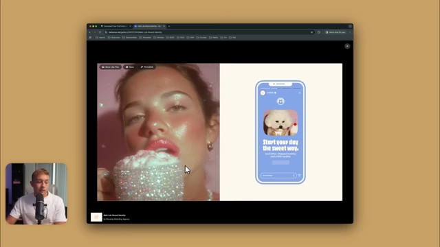
Instagram Story Mockup with Brand Fonts and Icon [ 00:18:03 ]
- Examples include a phone mockup featuring the Melt London logo.
- Impact of Video Additions
- Midjourney-generated videos are highlighted as a significant new addition to the brand identity offerings.
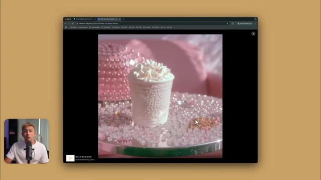
AI-Generated Video of Iced Coffee Reflecting Brand Aesthetic [ 00:18:15 ]
- Midjourney-generated videos are highlighted as a significant new addition to the brand identity offerings.
- Social Media Usage
Brand Guidelines [18:20]
- Final Client Presentation
- The completed brand identity is presented to the client using a specialized brand presentation template.
- This involves explaining all design decisions and showing the brand in practical applications, similar to the case study.
- Client feedback is gathered through a dedicated client portal (built using Notion).
- Creation of Brand Guidelines Document
- Upon client approval (ideally without revisions), a comprehensive brand guidelines document is created.
- This document serves as a "how-to-use" guide for the new brand identity, ensuring consistent future application.
- Completion of the Process
- This final step marks the culmination of the entire start-to-finish process for developing a complete brand identity.