Color Grading Masterclass: Essential Techniques for Workflow, Skin Tones, Deliverables, and Creative Saturation in DaVinci Resolve
Summary:
This video offers a comprehensive Q&A session for colorists, addressing common challenges and best practices in DaVinci Resolve. Key takeaways include:
- Color Management: Project output color space should consistently match the reference monitor's calibration and the final deliverable to simplify workflow and reduce variables.
- Dynamic Range: Use an exposure chart to verify that viewing LUTs maintain sufficient visibility (e.g., 2 stops below and above middle gray) in various tonal ranges.
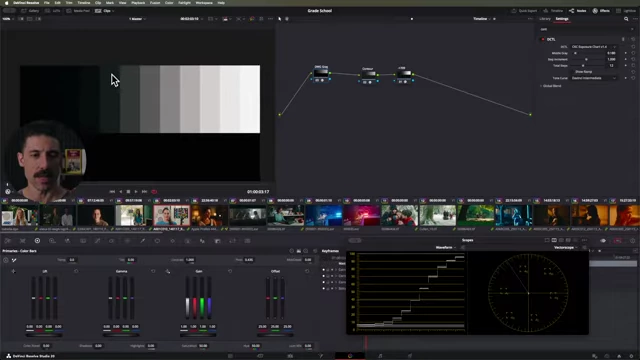
DaVinci Resolve's exposure chart displaying dynamic range steps in a grayscale gradient [ 00:11:30 ] - Skin Tones: Treat darker skin as less reflective, focusing on appropriate exposure for readability rather than applying arbitrary color biases.
- Export Settings: Establish a "source of truth" with a calibrated reference monitor. Export with matching color space tags, then re-import to verify consistency. Avoid QuickTime for client review due to its inaccurate color interpretation.
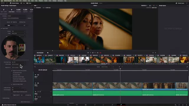
DaVinci Resolve's Deliver page showing export settings with explicit color space tagging [ 00:22:20 ] - Saturation Tools: The HSV node offers better control with gamma adjustments for targeting lower saturations, though care is needed to avoid noise. Color Slice provides per-primary adjustments.
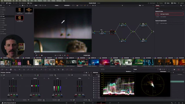
A zoomed-in view of cabinets in DaVinci Resolve, showing noise introduced by aggressive gamma saturation adjustments [ 00:36:10 ] - Shadows: Shadows do not inherently need to be neutral; they are expressive tools. Problems often stem from aggressive, non-linear adjustments rather than the original footage.
- Exposure to the Right (ETTR): This technique helps capture more light and detail, especially in shadows, but be cautious not to clip highlights. The goal is balanced dynamic range distribution.
- Beginner Advice: Focus on consistent practice (color grade, color grade more), learn guiding principles, and develop a critical eye by watching films like a colorist.
Simplifying Color Management & Monitor Setup [0:01:44]
- Aligning Color Spaces: The most straightforward approach is to ensure the project's output color space in DaVinci Resolve matches the calibration of your reference monitor and the requirements of your final deliverable.
- This consistency helps eliminate unnecessary variables and complexities in the grading pipeline.
- The analogy used is simplifying a golf swing by removing moving parts to achieve a better outcome.
- Industry Standard for Deliverables: For the vast majority of current deliverables, the standard is Rec 709 gamma 2.4.
- Your monitor should be set to display this standard, rather than its maximum color reproduction capability (e.g., Rec 2020), to accurately reflect the final output.
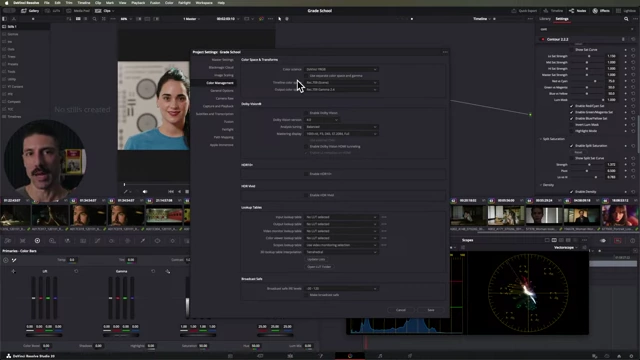
DaVinci Resolve project settings showing the output color space [ 00:05:40 ]
- Your monitor should be set to display this standard, rather than its maximum color reproduction capability (e.g., Rec 2020), to accurately reflect the final output.
Understanding Dynamic Range with Viewing LUTs [0:06:45]
- Ensuring Visibility: When creating a viewing LUT for a Director of Photography (DP), it's crucial to confirm that it retains visibility across the dynamic range.
- The question focused on ensuring 1-2 stops of detail above and below middle gray.
- Most standard viewing LUTs inherently provide this level of detail.
- Using an Exposure Chart: A useful tool for evaluating dynamic range distribution is an exposure chart (available as a free download).
- This chart helps visualize how different stops of exposure are rendered after applying the creative look and Display Rendering Transform (DRT).
- It allows you to check how many stops can be discerned before details become indistinguishable in the deepest shadows or brightest highlights.
- The video demonstrates that even with a creative look, two stops above and below middle gray are typically easily discernible, and often more.
DaVinci Resolve's exposure chart displaying dynamic range steps in a grayscale gradient [ 00:11:30 ]
Color Correcting Darker Skin Tones [0:11:58]
- Acknowledge Reflectance, Avoid Distortion: Darker skin tones are naturally less reflective, which is a neutral fact, not an inherent problem to be "fixed."
- The goal is not to make darker skin appear more reflective but to ensure visibility and readability without distorting its natural appearance.
- Prioritize Exposure: The primary tool for handling different skin reflectances, especially when multiple subjects are in a scene, is exposure adjustment.
- If subjects with varying skin tones are not adequately exposed on set, the colorist should adjust exposure in the grade to ensure each face is clearly readable according to creative intent.
- Avoid Arbitrary Color Biases: Dispense with "woo-woo" rules that suggest specific color shifts (e.g., reddish tones for darker skin or cooler tones for lighter skin).
- Focus instead on objective exposure and overall balance based on the visual needs of the image and the story being told.
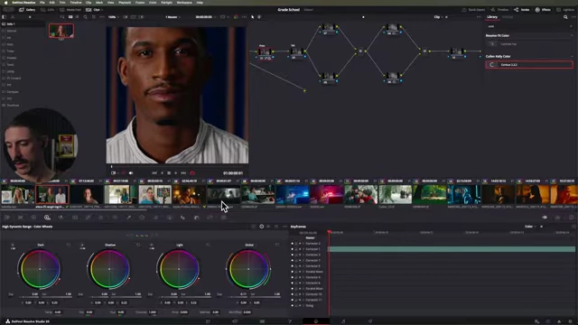
DaVinci Resolve showing a face and the HDR global exposure wheel being used for adjustment [ 00:16:50 ]
- Focus instead on objective exposure and overall balance based on the visual needs of the image and the story being told.
Demystifying Export Settings [0:19:38]
- The "Source of Truth": To ensure consistent exports, a calibrated reference monitor is essential. This monitor acts as the reliable benchmark against which all outputs are measured.
- Simplified Export Workflow:
- Align Settings: The output color space in your project settings (e.g., Rec 709 gamma 2.4) must match your calibrated reference monitor's setting and the target deliverable.
- Grade to One Target: Perform all grading with this single output target in mind, avoiding multiple passes or versions for different outputs initially.
- Export & Verify: Export your video (e.g., QuickTime ProRes or H.264), explicitly tagging it with the correct color space (Rec 709 gamma 2.4).
- Re-import for Sanity Check: Import the exported file back into DaVinci Resolve and play it on your reference monitor. It should match the original grade perfectly.
- Addressing the QuickTime Issue: QuickTime often misinterprets color space tags, resulting in brighter, inaccurate playback.
- This is a known issue with QuickTime, not a problem with your grade if the re-import test passes.
- Advise clients to avoid QuickTime for critical review, recommending alternative players or platforms that honor color space tags correctly.
- The core principle is to identify where the workflow "breaks" by introducing variables one at a time and addressing them systematically.
DaVinci Resolve's Deliver page showing export settings with explicit color space tagging [ 00:22:20 ]
Gamut Compression with DRTs vs. CSTs [0:26:09]
- Path to White Behavior: Gamut compression, specifically the "path to white" behavior where colors gradually desaturate and converge towards white as they become brighter, is a desirable characteristic in a Display Rendering Transform (DRT).
- Limitations of CSTs: Standard DaVinci Resolve Color Space Transforms (CSTs) generally do not effectively replicate this sophisticated path to white behavior.
- While some CST settings might offer slight saturation preservation, they fall short of the nuanced and controlled gamut compression achieved by dedicated DRTs like the "2499" mentioned.
- This is because creating accurate output transforms with proper gamut management is complex, and stock CSTs are designed for a broader range of applications.
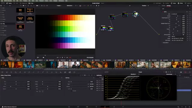
A color chart in DaVinci Resolve with a DRT applied, illustrating the "path to white." [ 00:27:20 ]
Color Slice vs. HSV for Saturation and Gamma Noise [0:28:52]
- HSV Node for Saturation Control: The HSV (Hue, Saturation, Value) node remains a preferred method for saturation adjustments due to its ability to control saturation with a gamma adjustment.
- Gamma's Advantage: Applying gamma to the saturation channel allows for targeting lower and mid-range saturations more effectively, preventing over-saturation in highlights. This differs from a simple gain adjustment, which affects all saturation levels uniformly.
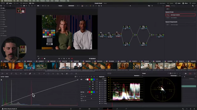
DaVinci Resolve's custom curves for saturation adjustments showing how gamma can target lower saturations. [ 00:32:40 ]
- Gamma's Advantage: Applying gamma to the saturation channel allows for targeting lower and mid-range saturations more effectively, preventing over-saturation in highlights. This differs from a simple gain adjustment, which affects all saturation levels uniformly.
- Color Slice Capabilities: While the HSV node offers valuable gamma control, Color Slice utilizes a more sophisticated color model and permits per-primary color saturation adjustments (red, green, blue, cyan, magenta, yellow), which is not natively possible with the HSV node.
- Gamma-Induced Noise: Aggressively boosting very low or zero saturation values using gamma can introduce noise or visual artifacts.
- This occurs because the tool attempts to inject color into areas that initially lack significant color information, fundamentally "breaking" the image's integrity.
- To mitigate this, a balanced approach combining gamma and gain is recommended to achieve the desired saturation without creating unwanted noise.
A zoomed-in view of cabinets in DaVinci Resolve, showing noise introduced by aggressive gamma saturation adjustments. [ 00:36:10 ]
Workflow: From Dark to Light (Oil Painting Analogy) [0:36:55]
- Building from Zero: The workflow philosophy aligns with traditional oil painters working from dark to light. The colorist emphasizes "building up from zero" in the image, meaning establishing the shadows first.
- Greatest Gains for Least Effort: Start by properly exposing the primary subject; this serves as the anchor for the entire grade.
- Shadows Over Highlights: Prioritize working with shadows (the low end of the image) before highlights.
- The human eye is more sensitive to detail and changes in darker areas, making thoughtful shadow treatment crucial for depth and legibility.
- Shadows are used for shaping, adding visual interest, and defining tonal detail.
- Highlights, in contrast, are more about managing clipping and simplification.
- Shaping with Custom Curves: Tools like custom curves are invaluable for molding the low end of the image, aiming for a "rich but thick" appearance with discernible detail.
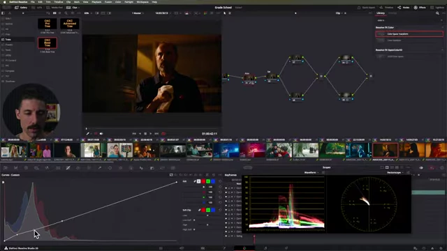
DaVinci Resolve's custom curves being adjusted to shape the low end of an image. [ 00:39:20 ] - Histogram Analogy: Visualize the histogram as a standing object; a strong, broad base in the low end indicates a robust image that feels "weighted" and holds up well.
Rec 709 vs. Rec 709A: Not a Standard [0:41:29]
- Rec 709A is Not a Standard: Rec 709A is not a recognized color space standard, meaning no display can be accurately calibrated to reproduce it.
- Avoid Unnecessary Variables: Utilizing Rec 709A introduces unnecessary variables and complexity into the color grading workflow, potentially leading to inaccurate and inconsistent results.
- Stick to Actual Standards: Always use established and calibratable standards like Rec 709 for project output, monitor calibration, and deliverables to maintain accuracy and predictability.
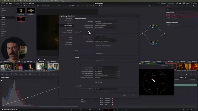
DaVinci Resolve's Project Settings window highlighting Rec. 709 vs. Rec. 709A output color spaces. [ 00:42:20 ]
RGB Mixer for Look Development [0:43:30]
- Manipulating Hue and Saturation: The RGB mixer is a powerful tool in Resolve for manipulating hue and saturation by creating a 3x3 matrix.
- This matrix defines how much of each input RGB channel contributes to each output RGB channel.
- Intuition vs. Power: While effective, the direct manipulation of RGB matrix values can be unintuitive for many colorists.
- Tools like Thatcher Freeman's "Matrix Manipulator" DCTL offer a more user-friendly interface to achieve similar results, allowing for more intuitive control over color shifts.
- Linear and Wide Effects: 3x3 matrices are known for their clean and linear operations. However, their influence is "wide," meaning adjustments to one color primary can broadly affect other colors across the vectorscope. This broad effect needs to be understood and managed.
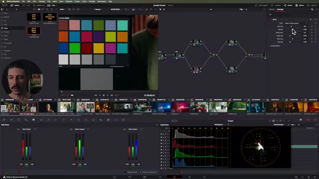
A color chart in DaVinci Resolve with the Matrix Manipulator DCTL, demonstrating hue and saturation adjustments. [ 00:46:20 ]
The Truth About Balancing Shadows [0:49:06]
- Shadows as Expressive Tools: Contrary to common belief, shadows do not need to be neutral or perfectly balanced. They are powerful expressive tools used in all visual media (film, painting, photography) to create depth, visual interest, color contrast, and establish visual hierarchy.
- Artful images often feature non-neutral shadows to enhance the aesthetic and emotional impact.
- Source of "Incorrect" Shadows: Oftentimes, perceived "incorrect" shadow biases are introduced by the colorist's own non-linear adjustments rather than being inherent in the source footage. This creates a "need for compensation" that complicates the grading process.
- Preventative Measures: To achieve naturally balanced or intentionally biased shadows without introducing problems:
- Avoid over-reliance on tools (like certain lift/gamma manipulations) that introduce non-linearities into the low end of the image.
- Camera sensors aim for a somewhat linear response to the scene; maintaining linear corrections (e.g., using linear gain in a balance node) helps preserve this neutrality and avoids creating new issues.
- Focus on a clean, principled approach to avoid creating problems that then require complex solutions.
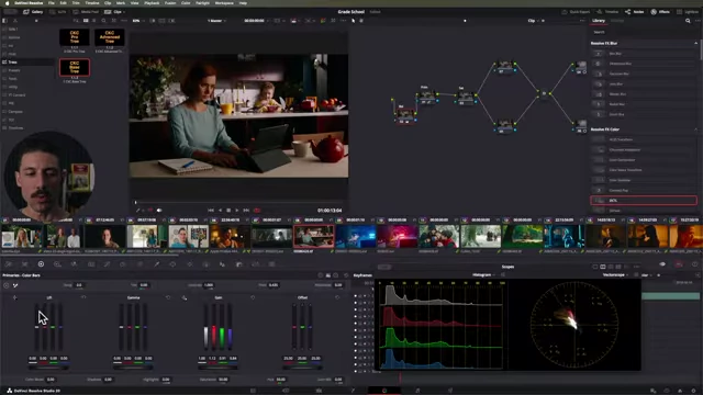
DaVinci Resolve displaying color wheels and waveform scope, showing linear gain in the balance node. [ 00:53:20 ]
Exposing to the Right (ETTR) and its Trade-offs [0:54:18]
- Level 1: The Primary Drawback: The main trade-off of exposing too far to the right is the risk of clipping highlights. This means losing irretrievable detail in the brightest areas of the image, making them unrecoverable during color grading.
- Level 2: The Nuance – Combatting "Expose to the Left" Bias: "Expose to the right" (ETTR) is largely a corrective philosophy against a common industry bias towards "exposing to the left" (underexposing).
- Reasons for Underexposure: Underexposure is often easier (less lighting, planning, equipment needed) and is inadvertently promoted by camera manufacturers highlighting high ISO cleanliness.
- Advantages of ETTR: Placing more light onto the camera sensor (getting a "thick negative") generally yields better image quality, especially in terms of cleaner, more detailed shadows.
- Balanced Dynamic Range: The true goal isn't just "more light" for its own sake, but intelligently distributing the camera's dynamic range to ensure sufficient latitude in both the low and high ends of the image. This provides maximum flexibility in post-production.
- Avoid Extremes: While leaning towards ETTR is beneficial, avoid over-exposing to the point where highlights are clipped, as this is an irreversible issue in grading.
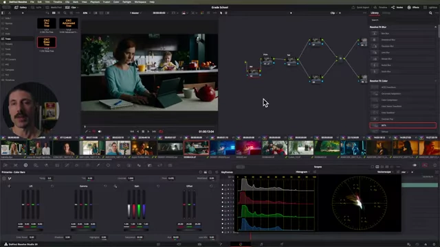
DaVinci Resolve's interface showing color wheels and waveform scope, illustrating dynamic range distribution. [ 00:58:30 ]
Starting Your Color Grading Journey [0:58:40]
- The Three-Part Prescription: For aspiring colorists, the advice mirrors a screenwriting principle:
- Color grade.
- Color grade more.
- Watch movies like a colorist.
- Focus on Principles and Frameworks (The "Why"): Emphasize understanding the underlying principles and philosophical frameworks of color grading over merely learning specific tool functions (the "how-to").
- Knowing the "why" enables a colorist to adapt to any software or toolset.
- Recommended Resource: "The Colorist's Ten Commandments" (the instructor's book) is suggested for beginners to grasp fundamental rules that guide creative and technical decisions.
- Learning from Diverse Sources: Explore YouTube and other instructional platforms for tips and techniques. Over time, you'll identify instructors and approaches that genuinely resonate and lead to consistent, high-quality results, helping to refine your own methodology.