Why Photographers Should Learn Color Theory: A Comprehensive Guide to Color in Visual Storytelling
This video explains why photographers should learn color theory by breaking down its fundamental concepts and practical applications.

- Colour Wheel: Learn how primary, secondary, and tertiary colors are formed and relate to each other.
- Components of Color: Understand Hue (the color itself), Saturation (intensity), and Luminance (brightness/darkness, crucial for contrast).
- Color Associations: Discover the emotional impact of different colors, noting these are guidelines for storytelling, not strict rules.
- Neutral Colours: Learn how they create "negative space," allowing main subjects to stand out in a frame.
- Colour Temperature: Differentiate between warm (reds, oranges, yellows) and cool (blues, greens, purples) colors and their contrasting effects.
- Colour Harmonies: Explore 3 common harmonies: Monochromatic (one color, various shades), Complementary (opposite colors for contrast), and Analogous (side-by-side colors for a natural look).
- Practical Application: Apply color theory in framing, wardrobe choices for portraits, and making subjects pop in product photography, all while planning with intent and experimenting to develop a unique visual style.
Introduction [0:00]
Colors play a crucial role in photography and filmmaking, significantly influencing how viewers perceive and feel about images. Understanding color theory provides a structured approach to utilizing colors effectively to enhance visual storytelling. This video aims to equip viewers with foundational concepts to improve their work.
Colour Wheel [0:30]
The color wheel is a fundamental tool for understanding color relationships.
- Formation of the Color Wheel:
- Primary Colors: The base colors are Red, Blue, and Yellow.
- Secondary Colors: Created by mixing two primary colors (e.g., Red + Yellow = Orange, Yellow + Blue = Green, Blue + Red = Purple).
- Tertiary Colors: Formed by mixing a primary color with an adjacent secondary color (e.g., Red-Orange, Yellow-Green, Blue-Violet).
- Purpose: The color wheel visually represents how all these colors relate to one another, which is essential for developing harmonious color schemes.
The color wheel illustrating primary, secondary, and tertiary color relationships. [ 00:00:50 ]
Components [0:43]
Colors are composed of three main elements, often represented by HSL (Hue, Saturation, Luminance).
- 1. Hue [1:06]:
- Definition: Hue is simply the pure color itself, the name of the color (e.g., red, orange, blue).
- 2. Saturation [1:19]:
- Definition: Saturation refers to the intensity or purity of a color.
- Effect: Reducing saturation causes a color to lose its vibrancy and move towards gray.
- If a darker color is used, desaturation moves it towards black.
- If a lighter color is used, desaturation moves it towards white.
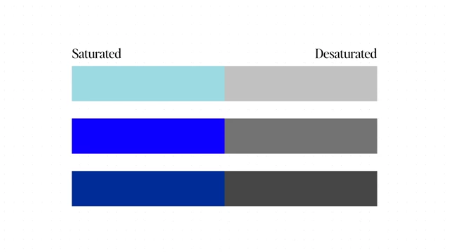
A visual demonstrating saturation levels, from pure to desaturated blue. [ 00:01:35 ]
- 3. Luminance (aka Lightness) [1:37]:
- Definition: Luminance describes how bright or dark a color is.
- Importance: Luminance is crucial for controlling contrast between colors, which helps in separating elements in a frame.
- Practical Application: To check for good luminance contrast, convert an image to black and white. If the image appears flat, it indicates a lack of luminance contrast.
- Example: A well-composed image will have sufficient luminance differences to make the subject stand out from the background.

A comparison of low contrast and high contrast images, highlighting the effect of luminance. [ 00:01:59 ]
Associations [3:10]
Colors evoke distinct emotions and psychological responses, known as color associations.
- Emotional Impact of Colors:
- Red: Often associated with passion, energy, danger, or power.
- Blue: Can signify stability, trust, but also isolation.
- Orange: Often linked to happiness, warmth, and fun.
- Guidelines, Not Rules: These associations serve as valuable guidelines but are not rigid rules. A color's meaning can be influenced by context and other elements in the composition. For instance, using red doesn't automatically preclude showing luxury.

A list of common color associations and their emotional impacts. [ 00:03:14 ]
Neutral Colours [3:55]
Neutral colors play a vital role in creating visual clarity and guiding the viewer's eye.
- Creating Visual Space: Just as negative space in composition helps declutter an image, neutral colors provide "breathing room" in a color palette.
- Preventing Confusion: If all colors in a frame are super saturated and vibrant, the viewer might become confused about where to focus.
- Guiding Attention: By making some colors comparatively more saturated than others, the viewer's eyes are naturally drawn to the more vibrant elements.
- Subject vs. Background: Saturated colors can represent the main subject, while neutral colors act as the negative space or background, helping the viewer understand what to look at and focus on.
- Maintaining Balance: This approach creates balance and prevents chaos, making the frame appear more intentional.

A product shot illustrating how saturated colors for the main subject stand out against neutral background colors. [ 00:04:28 ]
Colour Temperature [4:50]
Color temperature categorizes colors into two main groups.
- Warm Colors: Include reds, oranges, and yellows. In camera terms, these are generally associated with lower Kelvin temperatures (e.g., 1000K).
- Cool Colors: Include blues, greens, and purples. In camera terms, these are generally associated with higher Kelvin temperatures (e.g., 10000K).
- Differentiation: A simple way to distinguish them is by drawing a line across the color wheel; one half will be warm, the other cool.
- Contrast and Combination: While you can stick to entirely warm or cool palettes, combining them effectively creates contrast.
- Teal and Orange Look: A popular example is the teal and orange contrast, where skin tones (warm) are contrasted with backgrounds or shadows (cool/teal).

An example of using contrasting warm and cool colors (teal and orange) in a portrait setting. [ 00:05:45 ]
- Teal and Orange Look: A popular example is the teal and orange contrast, where skin tones (warm) are contrasted with backgrounds or shadows (cool/teal).
- Developing Understanding: Separating colors into warm and cool helps develop an understanding of how to effectively use colors together.

A color temperature bar showing the spectrum from warm (red, 1000K) to cool (blue, 10000K) colors. [ 00:05:03 ]
- Contrast and Combination: While you can stick to entirely warm or cool palettes, combining them effectively creates contrast.
Colour Harmonies [5:57]
Color harmonies are established ways of selecting colors from the color wheel that relate pleasingly to each other, acting as a "cheat sheet" for effective color combinations.
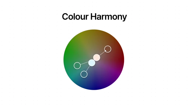
- 1. Monochrome [6:07]:
- Concept: Utilizes variations (different shades and tints) of a single color.
- Distinction: Not to be confused with black and white; it can be any chosen color.
- Effect: Creates a simple, minimal, yet powerful and cohesive look.
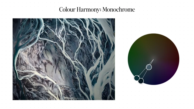
A monochromatic image of an abstract river pattern with the color wheel showing a single color selection. [ 00:06:17 ]
- 2. Complementary [6:23]:
- Concept: Involves selecting two colors that are directly opposite each other on the color wheel.
- Effect: Creates high contrast and visual excitement.
- Example: The popular teal and orange aesthetic is a prime example of a complementary color harmony.

A vibrant image demonstrating complementary color harmony using orange and green. [ 00:06:27 ]
- 3. Analogous [6:37]:
- Concept: Uses three colors that are side-by-side on the color wheel.
- Effect: Delivers a natural, harmonious, and easy-on-the-eyes appearance, often found in nature.
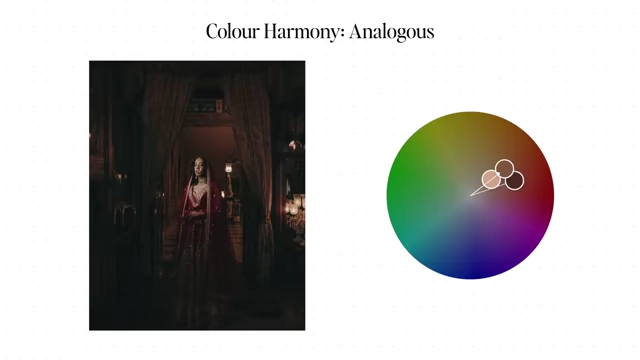
An image illustrating analogous color harmony with warm, adjacent colors from the color wheel. [ 00:06:37 ]
- Tools for Color Harmony:
- Online tools like
color.adobe.comcan help explore and generate color harmonies based on your selections.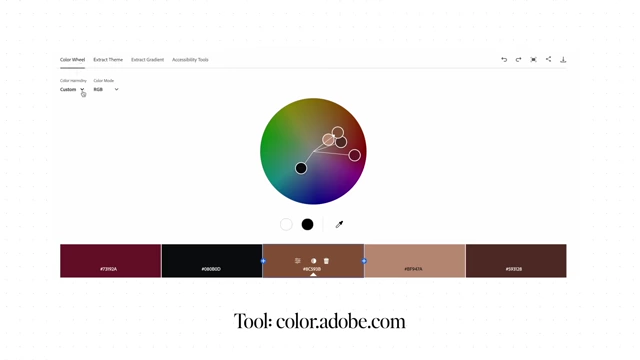
A screenshot of the Adobe Color tool, used for exploring and creating color harmonies. [ 00:06:49 ]
- Online tools like
How to use it [6:54]
Applying color theory in practice involves intentional choices and experimentation.
- 1. Framing Your Shot [6:59]:
- Mindfulness: Be conscious of all colors present in your frame.
- Subject Emphasis: Identify which colors help your subject stand out and which colors might be distracting. This guides your composition decisions.
- 2. Portrait Photography [7:13]:
- Outfit Selection: A crucial decision, as clothing colors heavily influence the mood and theme of the portrait.
- Impact on Personal Style: Understanding color theory can even improve your personal dressing sense.
- 3. Product or Food Photography [7:33]:
- Making the Subject Pop: Ensure the chosen colors for your product or food help it stand out, rather than blending in with the background.
- Informed Choices: Color theory provides a framework for deciding which colors to use to achieve this separation.

A product shot demonstrating the use of complementary colors (orange-brown and blue) to make the subject pop. [ 00:07:51 ]
- 4. Intentional Decisions [7:40]:
- Putting Theory into Practice: All the learned color theory (hue, saturation, luminance, harmonies) comes together when making intentional color decisions. For example, if a product is color X, you might choose a complementary color Y for the background to create visual impact.
- 5. Developing a Consistent Visual Style [8:06]:
- Professional Trait: Many successful professional photographers have a consistent visual style, and color plays a significant role in establishing this identity.
- 6. Project Planning [8:20]:
- Client Goals: When planning a project, consider the client's goals, the story you want to tell, and the emotions you wish to evoke. These factors directly influence your color choices.
- 7. Experimentation [8:32]:
- Continuous Learning: While developing a style is important, experimenting with colors is essential for learning and improving your work. Don't be afraid to try new things.
Conclusion [8:56]
To truly benefit from this knowledge, actively apply color theory in your work.
- Practice and Reflection: Watch the video, take notes, implement the concepts in real-life photography, and then reflect on your results to identify areas for improvement. This iterative process is key to mastering color theory and enhancing your craft.